Yield! Fall of Rome
Onboarding redesign and full UI overhaul for Billionworlds
Yield! Fall of Rome is a turn-based 4X strategy game set in the final days of the Roman Empire, developed by the studio Billionworlds and published by Daedalic Entertainment. I was the sole designer, responsible for game UI, UX and graphic design, not including the 3D modelling of the game itself.
Where Billionworlds (published by Daedalic Entertainment)
When 2023
Team Sole designer, with the Billionworlds game team
My role Game UI, UX and graphic design
Result From a beta struggling with retention, to thousands of players shortly after Steam launch
The problem
Billionworlds had a strong concept and a core of highly engaged long-term players in beta access when I was onboarded.
However when analysing usage data from the beta, it also told different story: new players were dropping off before they even reached the core game loop. For a strategy game with real depth, that first encounter was make or break, and too many people gave up before they got to the good part.
I set out to figure out why.
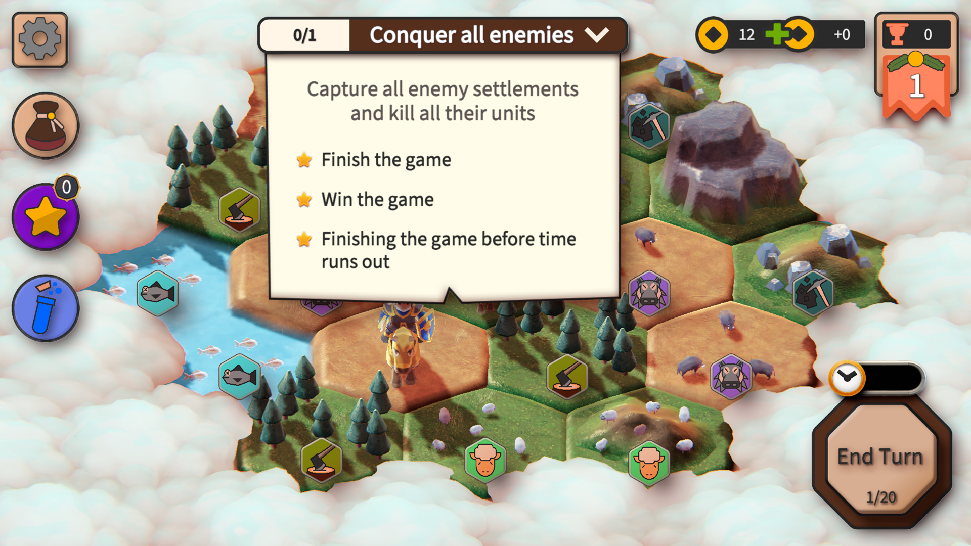
The before: When I started, the game instructions had a lot of room for improvement and in several places they still contained leftover placeholder text that had never been cleaned up.
The process
I started with open user tests to find out where the challenge actually was, rather than assuming. The tests revealed a clear pattern: the onboarding explained the game without teaching it. Players were handed information but not experience, and by the time the explanation was over, many had already lost interest and were bored.
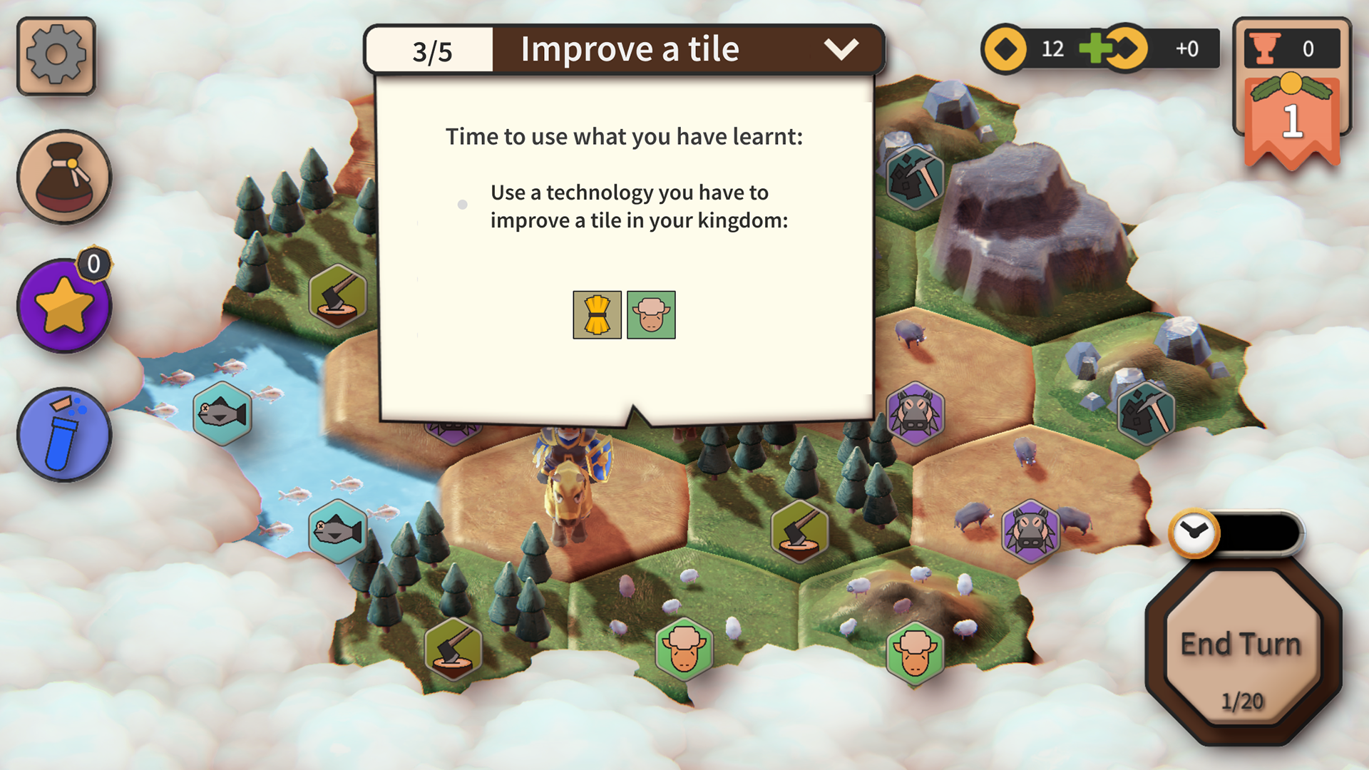
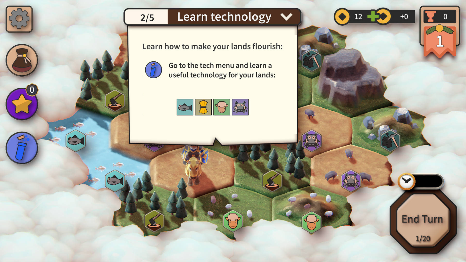
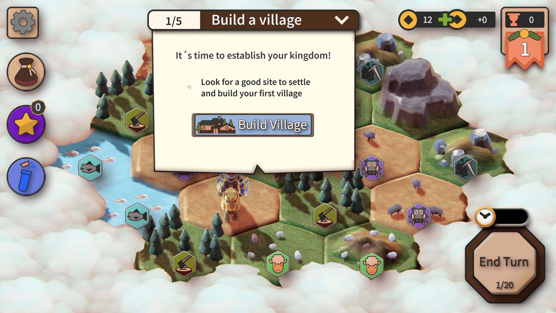
I iterated towards an active onboarding better suited for the game's complexity. It was shorter, more engaging, and designed to get players through the actual mechanics before they gave up. Instead of essentially being showed a really slow paced video of how the game worked, players were now guided and nudged through actually doing it themselves.
User testing the early sketches of the new onboarding sequence, from before I redesigned the UI.
UI and menu redesign
While working on the onboarding flow we decided together with our investors and mentors at startuplab that we were going to shift from mobile first to desktop first. On my initiative we also decided to combine that shift with a complete UI and menu overhaul.
The transition taught me a lot about how a platform choice is really a decision about who the product is for and how they play. Once we understood that our players wanted longer, more strategic sessions, the mobile-first structure stopped making sense, and rebuilding for desktop opened up a density of information that the game actually needed.
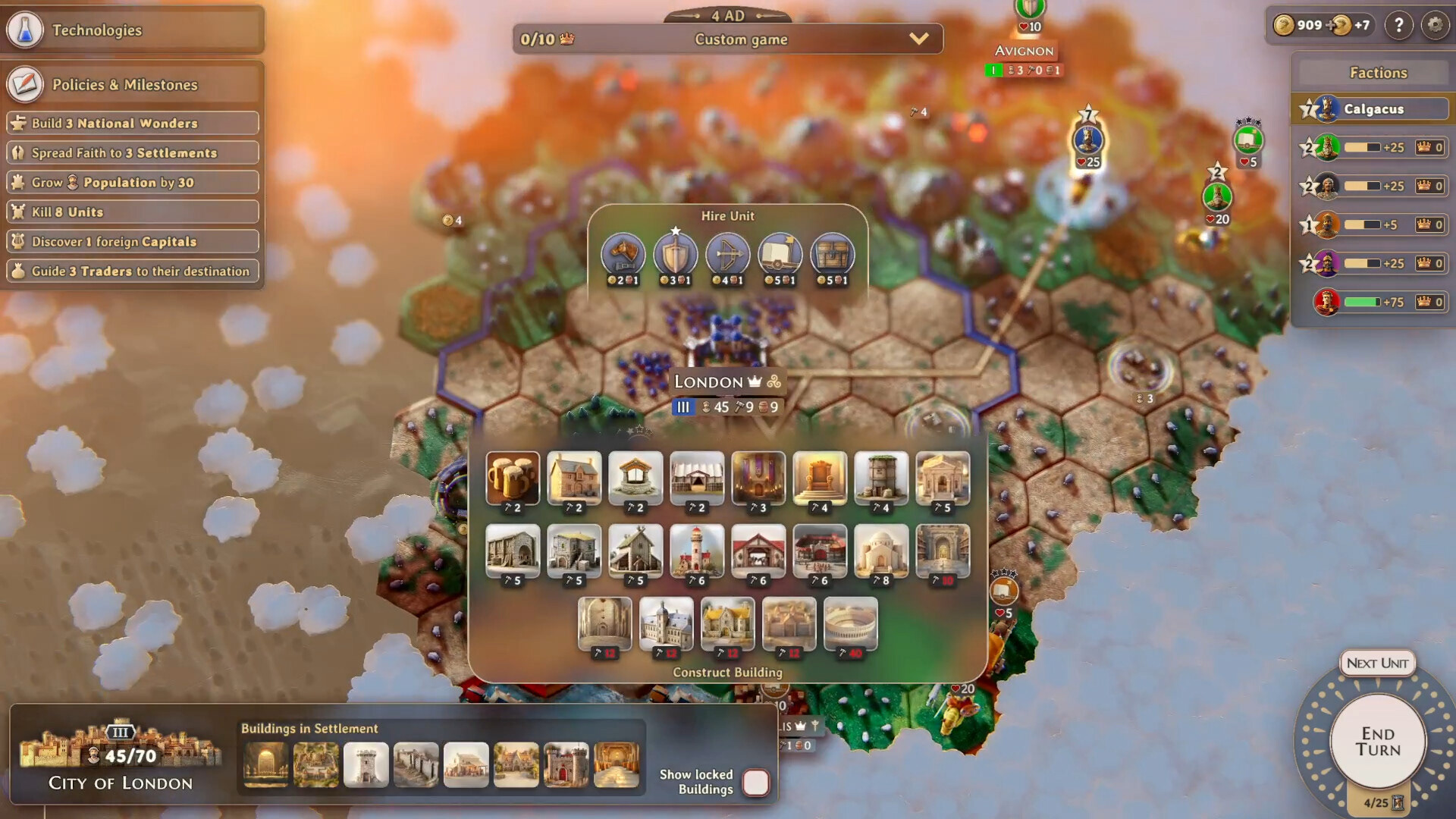
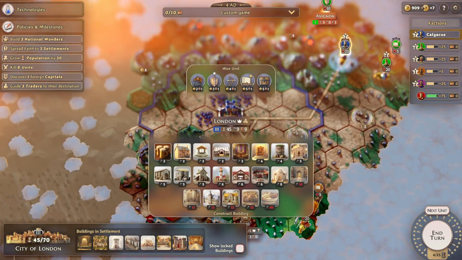
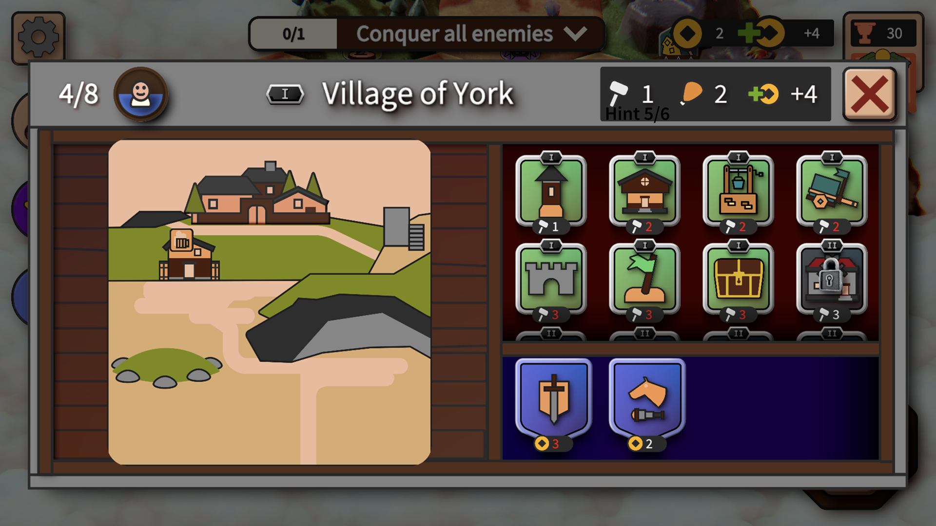
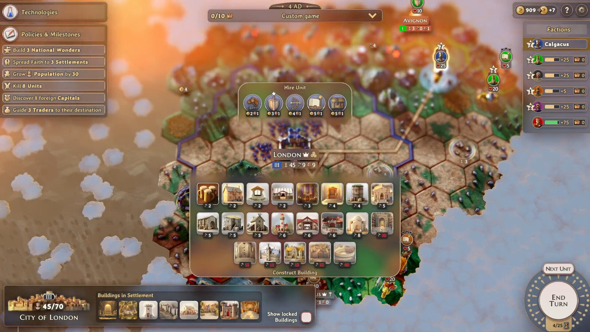
The city view before and after my UI makeover.
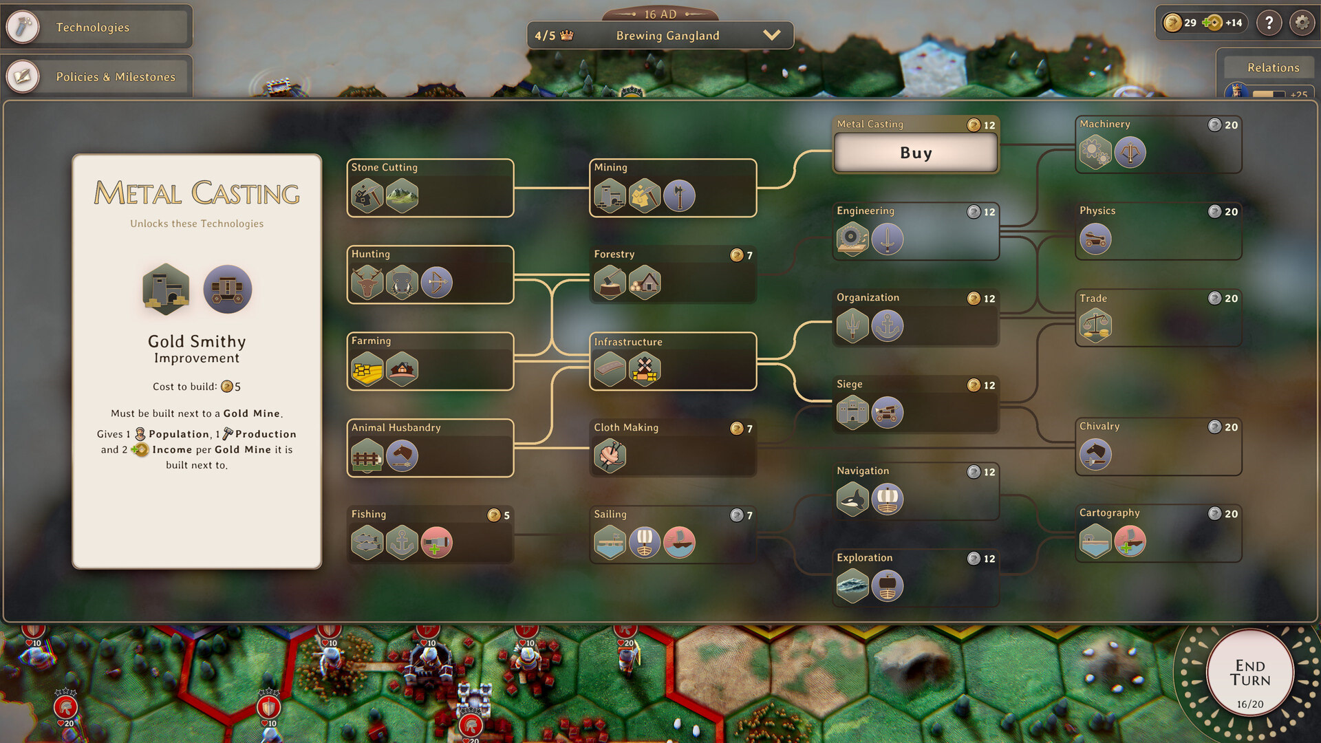
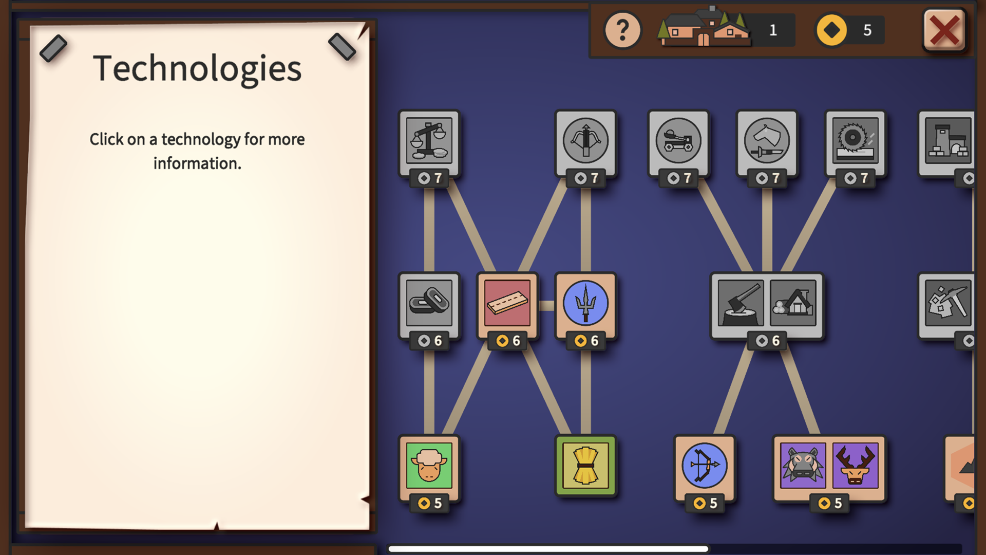
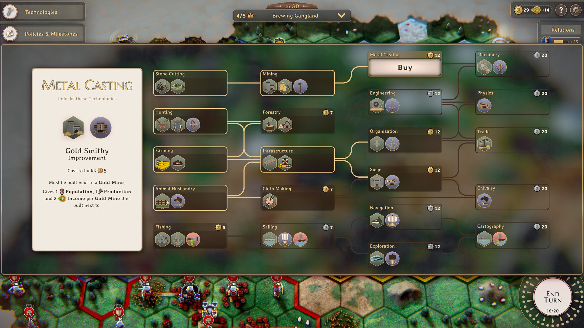
The tech tree, before and after shown below. Testing showed that the different technologies needed better explanations. I solved this by introducing symbols, differentiating more clearly between unlocked and locked connections, and I spent time writing out the benefits of each technology in more detail. I also gave it a visual lift, moving away from the retro 2D look while keeping it in line with the game's ancient Rome theme.
The result
Retention and player satisfaction improved measurably after the redesign. Yield! Fall of Rome went from a beta struggling to hold onto players, to several thousand purchases shortly after its Steam launch.
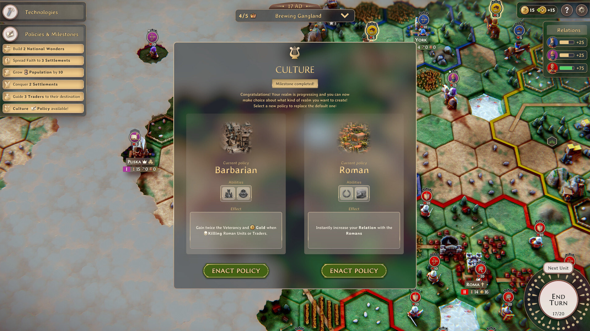
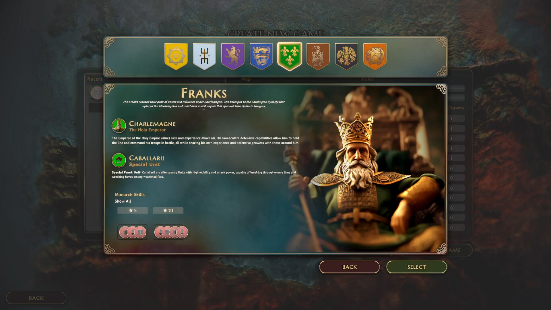
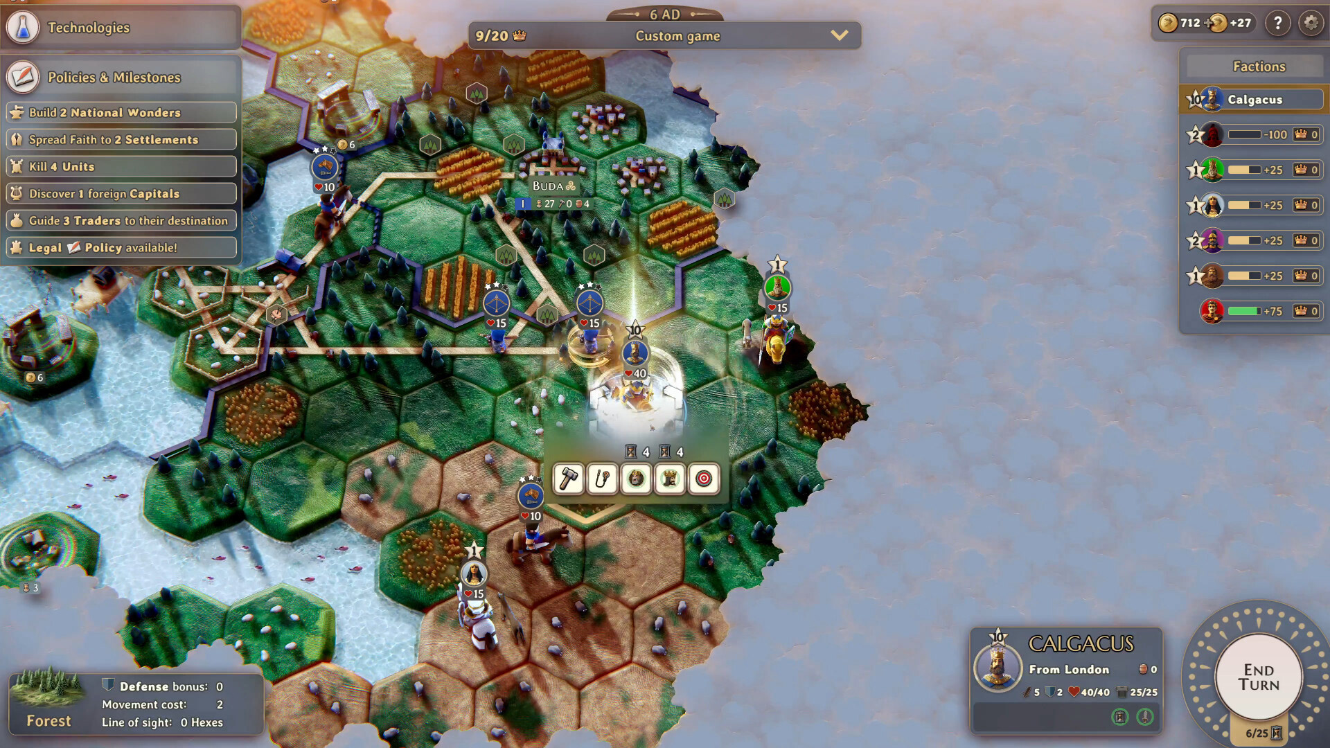
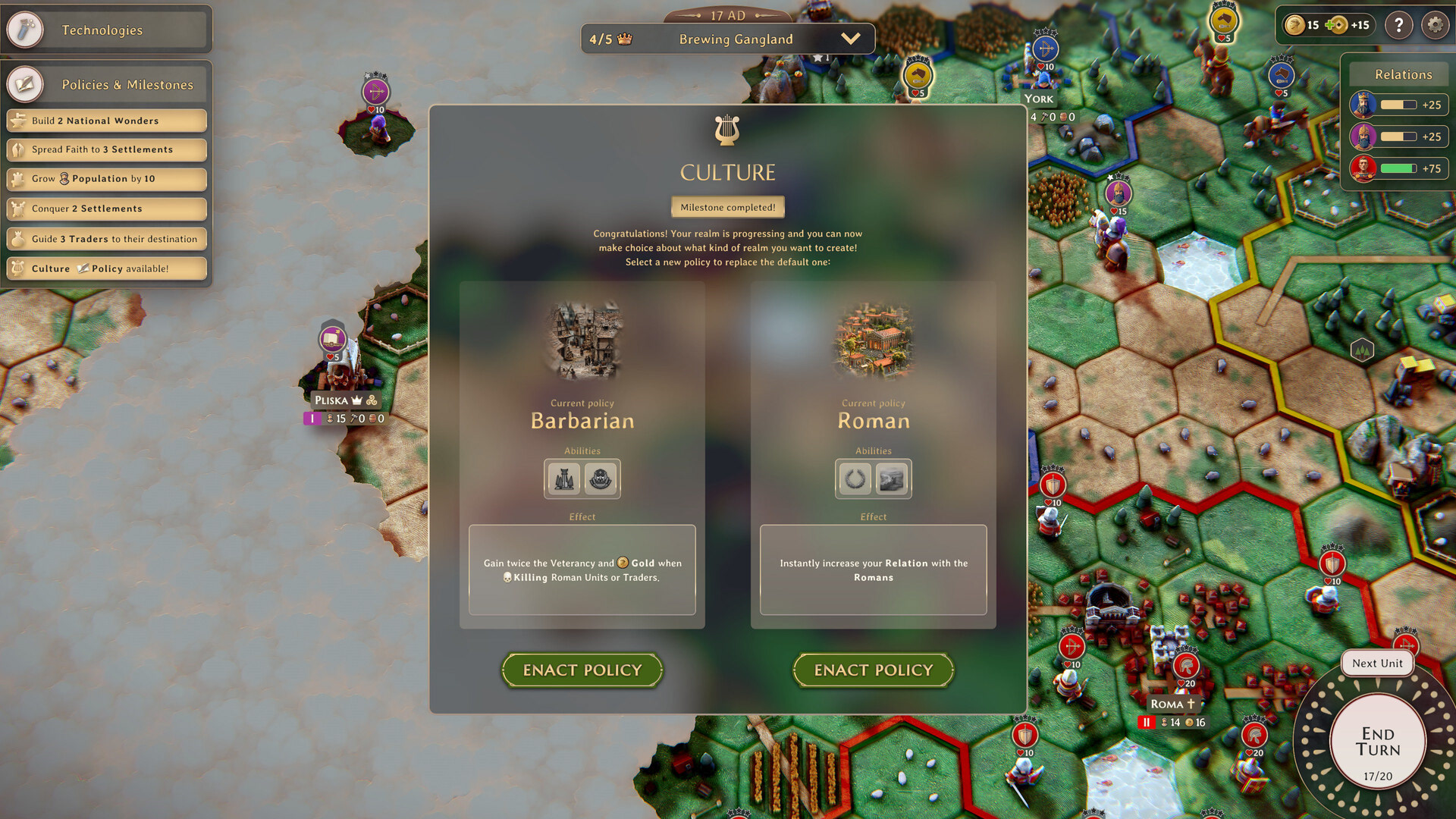
Some more screenshots from the finished game UI shown below.