Making hidden logic visible when creating admission rules in fS admin
How do you rethink a slow, complex task so it's within reach of someone new to the job, not just the experts?
Across my work on FS Admin, one thing keeps becoming clear: a lot of everyday tasks are reserved for a handful of expert users, simply because the interface is too complex for even a simple task to be handed to someone new.
Defining the admission rules for a study programme, the regelverk, was one of those tasks. I redesigned it so the logic is visible in the interface instead of held in the user's head, and setting one up went from something only experts attempted to something anyone in the office can do.
Where Sikt, Norwegian Agency for Shared Services in Education and Research 
When 2024, ~2-month striketeam 
Team Design, frontend, backend, database 
My role Interaction design, user experience, prototyping and testing
Result Redesigned the admission-rule module from an expert-only task to one anyone in the office can do
What is a regelverk?
In FS, the admission setup for a study programme is called its regelverk. It brings together two rule sets and a link: a Kompetanseregelverk, which decides who is eligible, a Rangeringsregelverk, which decides how the eligible applicants are ranked against each other, and a link to the applicant's grunnlag, the type of qualification they hold, such as a Norwegian upper-secondary diploma. Each of the two rule sets is, in effect, a long nested AND/OR statement, "applicants with this background, or that background plus a subject requirement, ranked by these point types", and it has to be exactly right, because it governs who gets in.
Why the old solution was difficult to use
Building one meant working through at least six separate pages, each reached from a different list or search. The interface mirrored the database structure rather than the task: you created the smallest building blocks first, assembled them into larger units, and worked your way up level by level.
The logic that tied it together was never shown anywhere. It lived in the relationships between database tables, and the user had to hold the whole structure in their head.

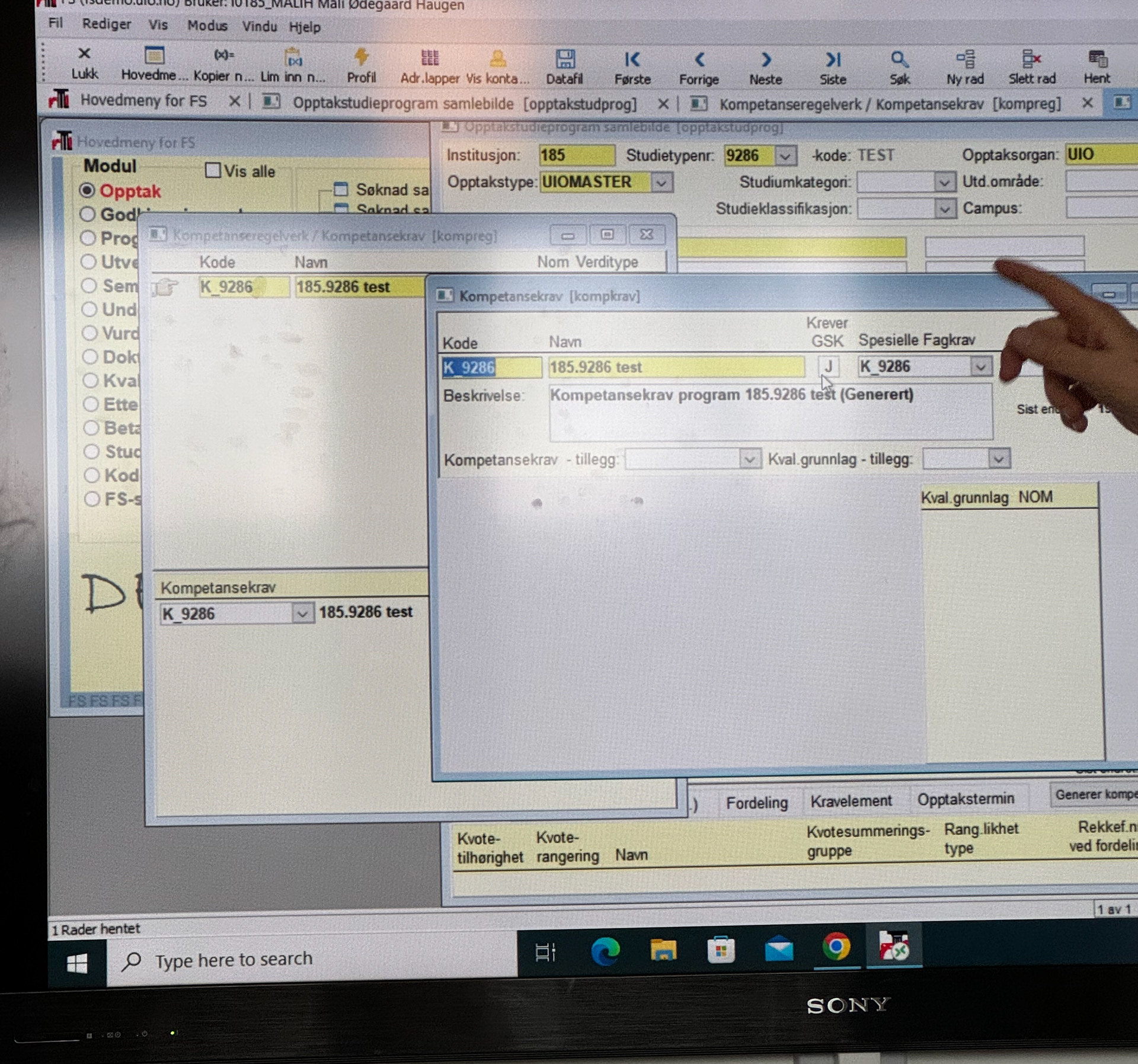
Early user testing and observation of the old solution. Depending on what kind of institution, the users are building the regelverk in one of two interfaces. My design replaces this module in both of them. This user is showing some of the windows needed to build a single regelverk.
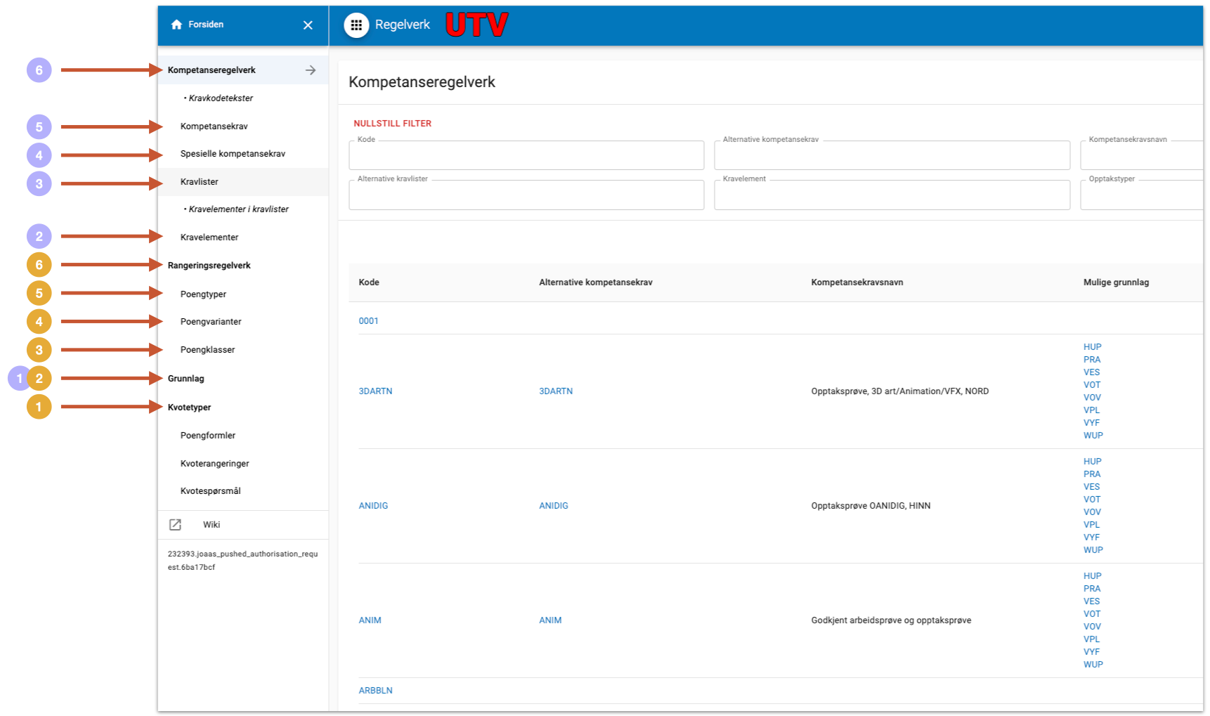
The other previous user interface is slightly newer, but with few improvements. The steps required to build the admission ruleset or kompetanseregelverk shown in purple, and the steps for the admission ranking rules or rangeringsregelverk in yellow. One ruleset, built across six pages that mirrored the database.
How I worked
This was done as part of a cross-team striketeam, with fast iteration. I ran observation and interviews with caseworkers at UiO and HK-dir, synthesised what I found, built prototypes, and tested them back with the same users, alternating user sessions with internal workshops on how the domain hangs together, on the form design, and on the backend. Four findings shaped everything that followed:
The work is not one job. Needs differ a lot depending on whether someone works with local admissions, FSU, UHG or teaching admissions. There is no single "the user."
A regelverk is nothing on its own. It only makes sense alongside application processing and the admission run it feeds into.
Building bottom-up was slow, hard and unnecessary. The order the old interface forced on people was an artefact of the data model, not of the task.
Versioning was important to the users, not least for trying out scenarios in samordna opptak in advance.

From the very first team workshop I used drawing and visualisations to communicate effectively with the developers, and to make sure we were really understanding each other.
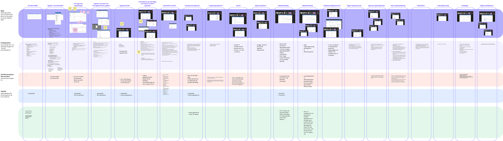
One of several service maps I made throughout the research and user testing phase of this project, to unpack how the admission process actually connects to the rest of the user user journey for the administrators of samordna opptak. Laying out the whole admission process helped the team see what a regelverk actually feeds into, and why it could not be designed in isolation.
Unravelling the complexity
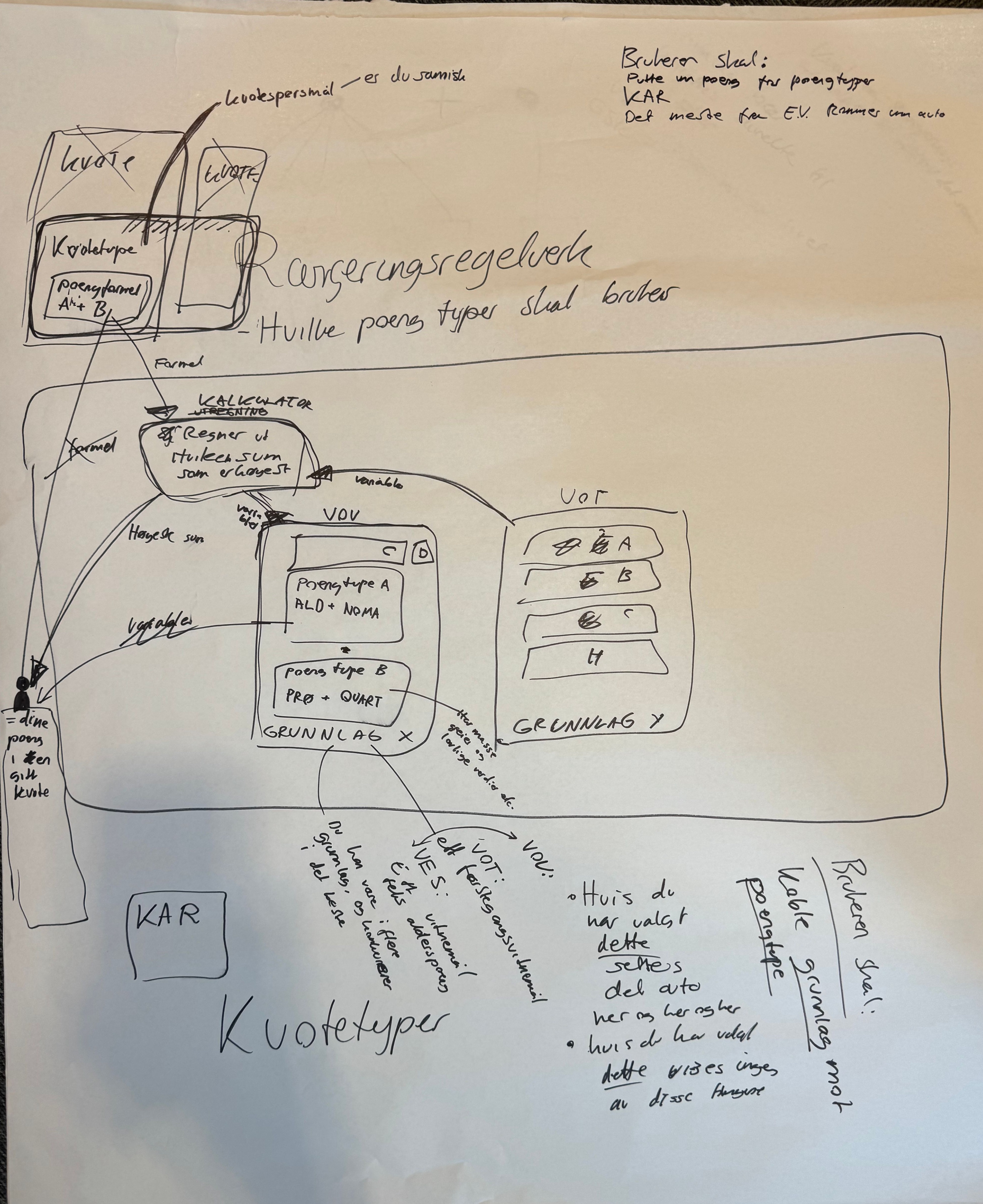
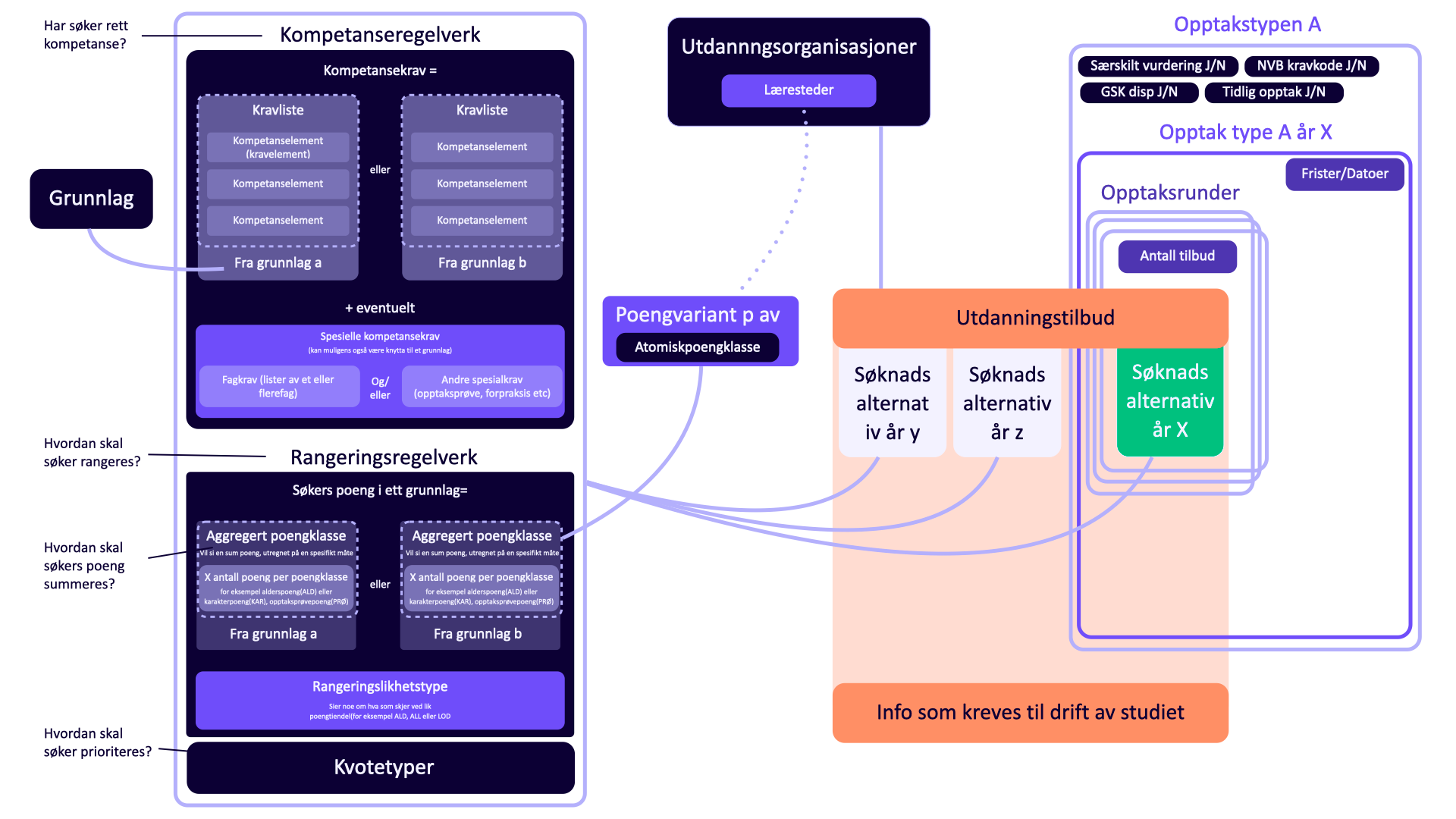
To wrap my head around the domain I drew a model of how the components of both competence rules (kompetanseregelverk) and the ranking rules (rangeringsregelverk) actually relate, organised around the four questions a caseworker is really answering: does the applicant qualify, how are they ranked, how are their points summed, and how are they prioritised. That model became the shared reference the team worked from. It also made one thing obvious: the interface should follow those four questions, not the shape of the database.

This mental model turned into a working document for the team, first to get our own heads around the domain, later to decide what could and should change in the data model and the interface.
Turning the mental model into an interface
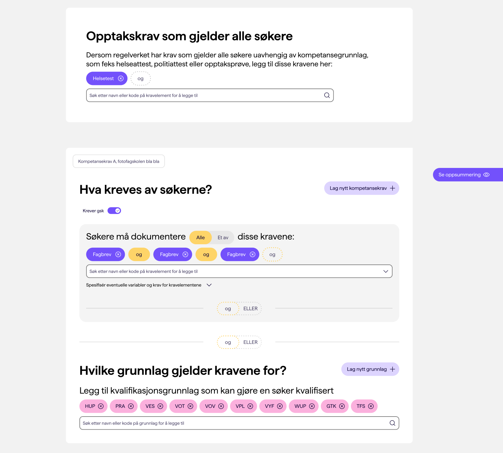
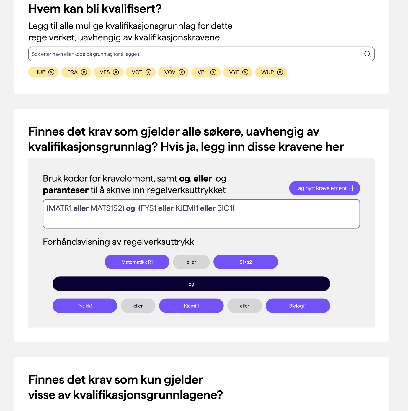
After initial rapid prototyping, I tested two main concepts for the kompetanseregelverk, the part that decides who is eligible. One leaned entirely on plain language: the interface asks direct questions, such as which backgrounds should qualify an applicant for this programme, and which requirements everyone must meet versus which apply only to certain applicants. The other let the user write the rule more like a formula, a nested AND/OR expression with parentheses, closer to how the logic is structured underneath.
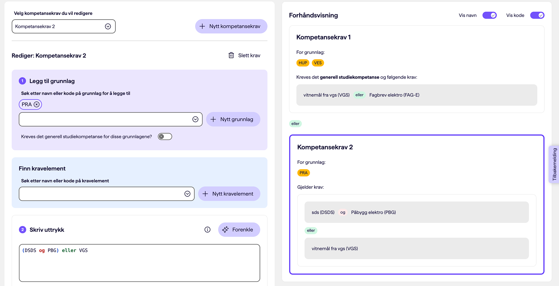
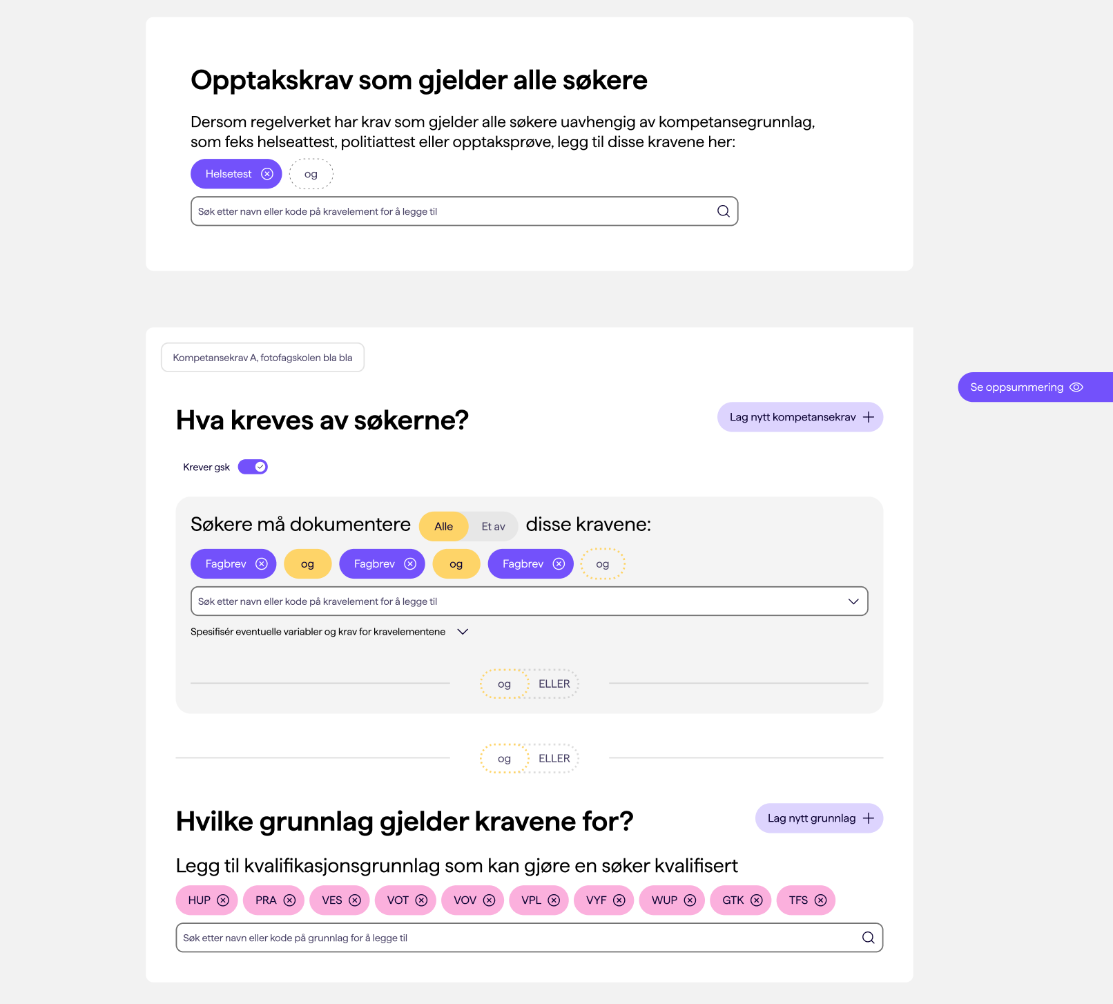
Testing split along experience. The experts, the ones who already carry all the codes in their head, leaned toward writing the AND/OR expression directly. The less experienced users, and the less technical ones generally, clearly preferred being led by questions. Since the goal was to make the task doable for everyone and not just the experts, I didn't pick one. The final kompetanseregelverk combines both: you make the choices through menus and questions, and you adjust how they relate as an editable AND/OR expression. Exploring the two directions is what showed me they didn't have to be either/or, that the approachable path and the precise one could live in the same interface.
Key choices
Flip the hierarchy; manage rules where they belong. Instead of assembling abstract entities from the bottom up, you manage a programme's kompetanseregelverk and rangeringsregelverk directly from the study programme itself. The intermediate levels people used to build by hand are handled by the interface, and the logic that was hidden between database tables is now expressed directly on screen. Each regelverk is still a reusable object in its own right: the same kompetanseregelverk or rangeringsregelverk can be linked to several programmes, and each one has its own page that shows, and lets you manage, exactly which programmes use it.
Write the rule out in plain language. Inside a regelverk, what it actually requires is spelled out as legible text, with the AND/OR structure shown rather than implied. The same surface carries its version history and lets you edit everything in one place.
Make a nested AND/OR statement readable. This was the hardest part. The structure had to be readable, editable and verifiable without the user ever losing track of it. I looked at how the same problem is handled in completely different contexts, such as SQL query builders and code editors, and translated that into something usable, guided by accessibility principles. I developed several concepts and refined them through iterations and testing of hierarchy, wording and placement.
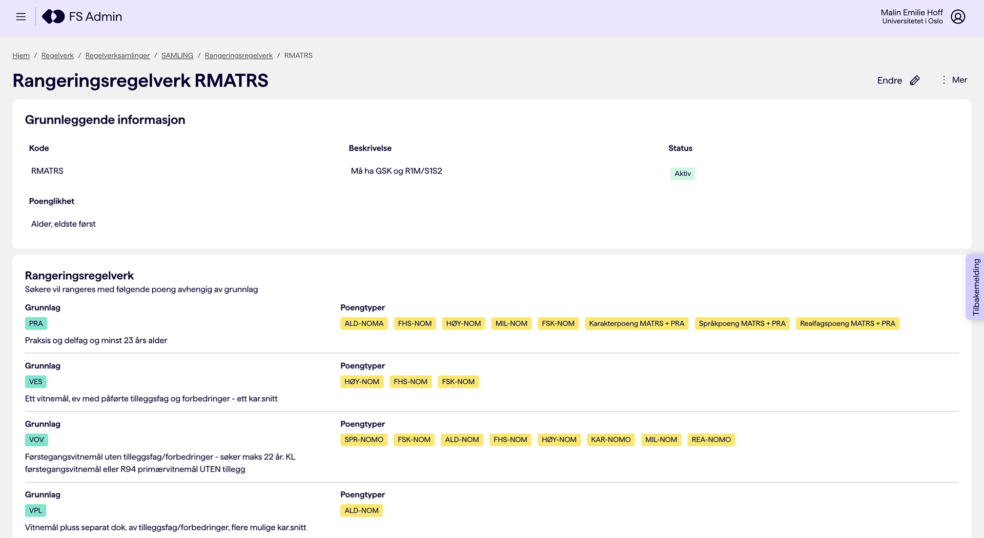
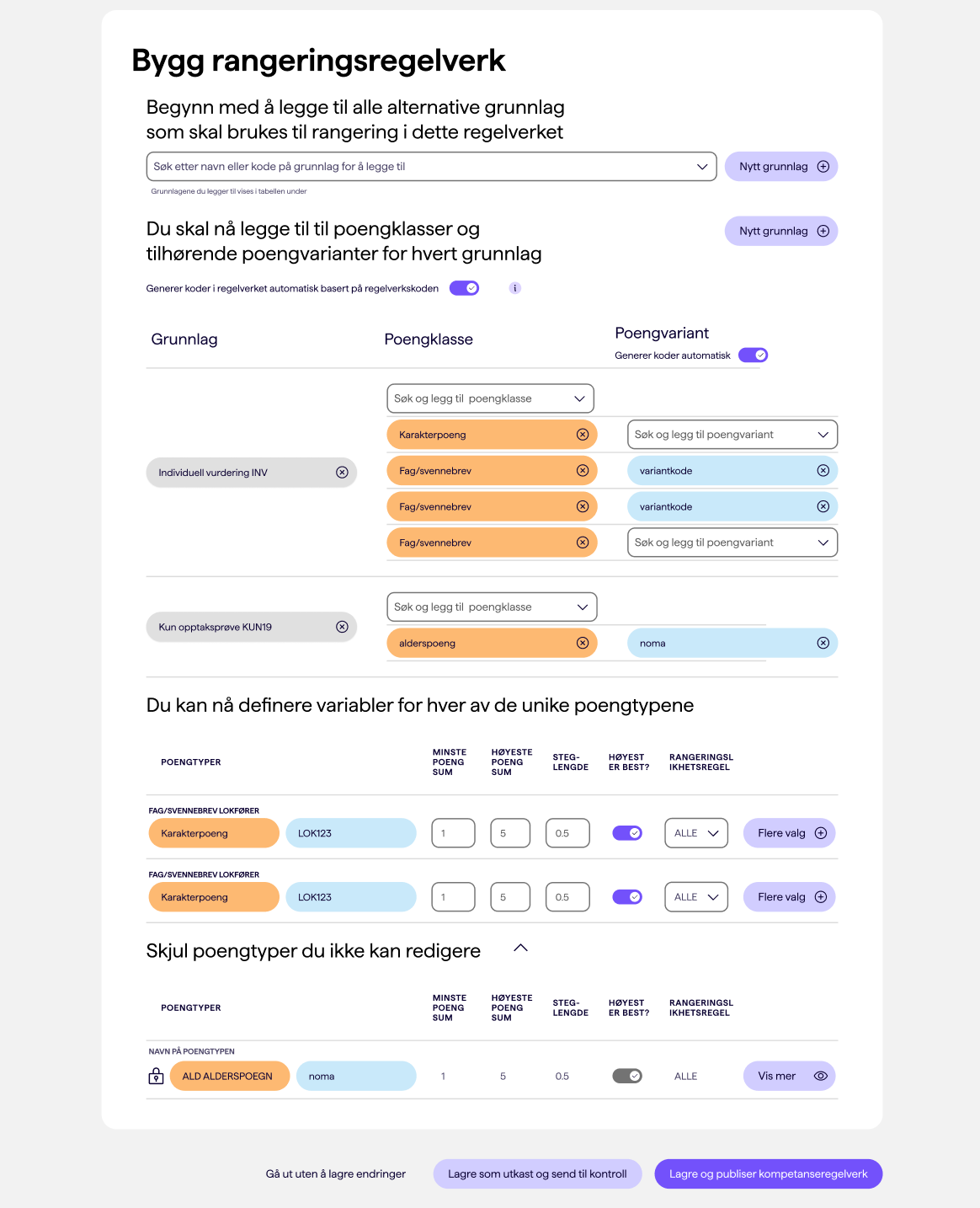
Ranking, built the way it actually connects. The rangeringsregelverk, which decides how the eligible applicants are ranked, was a separate design, but the underlying move was the same. Instead of spreading it across page after page, you build it up the way the pieces are actually connected: which point types count, how they are summed, and what happens when applicants tie.
On top of this, the concept added versioning, starting from templates, and different levels of access control, all things the four findings had pointed to. Together with a UI designer I later refined the finished interface, with a focus on condensing and tightening the UI according to user requests.
Outcome
The concept tested very well and was carried through with only cosmetic changes. The user experience of setting up both a rangeringsregelverk and kompetanseregelverk went from six pages to one each, and from something only expert users attempted to something any administrator can do, because the logic is now visible in the interface instead of held in the user's head.
Underneath is the final editing mode of a kompetanseregelverk, and the viewing mode of the rangeringsregelverk.
Back to Top