Vienna design week
Vienna Design Week is Austria's largest curated design festival, held in Vienna since 2007 and drawing more than 40,000 visitors to around 200 events each year. We set out to reimagine its visual identity around one question: what makes design design?
Our answer was the idea itself, the spark of creativity before anything takes it final shape.
Where Die Angewandte, University of Applied Arts Vienna
When 2022
Team Myself and two other graphic design students
My role Website design and lead on the logo animation, plus the shared visual language and concept development
Result Mobile-first website prototype, graphic profile, logo and animation, posters, physical signage and merch
festival wEBsite
The website is the festival's main entry point — where most visitors first meet Vienna Design Week and decide what to actually go and see. With hundreds of events spread across the city over ten days, the real problem was helping people find their way without getting lost, so I built the site around four principles: fast overview, clear hierarchy, quick access and an easy way to save favourites.
The front page opens with the animated logo and two clear routes in: the programme or the map. A Today / Tomorrow feed shows what's on right now, and every event sits in a card with a bold title, a short description and a heart to save it for later. The same four filters - date, format, district and discipline, work identically across the programme, the map and the favourites page, so the way you narrow things down never changes from page to page.
On the map, the identity's V-shape becomes the location pin, and saved events gather on their own page, ready to export without the need to create an account.
The site features a restrained black-and-white interface that lets the festival event's own imagery bring the colour.
Feel free to test the prototype out for yourself in the very bottom of this page.
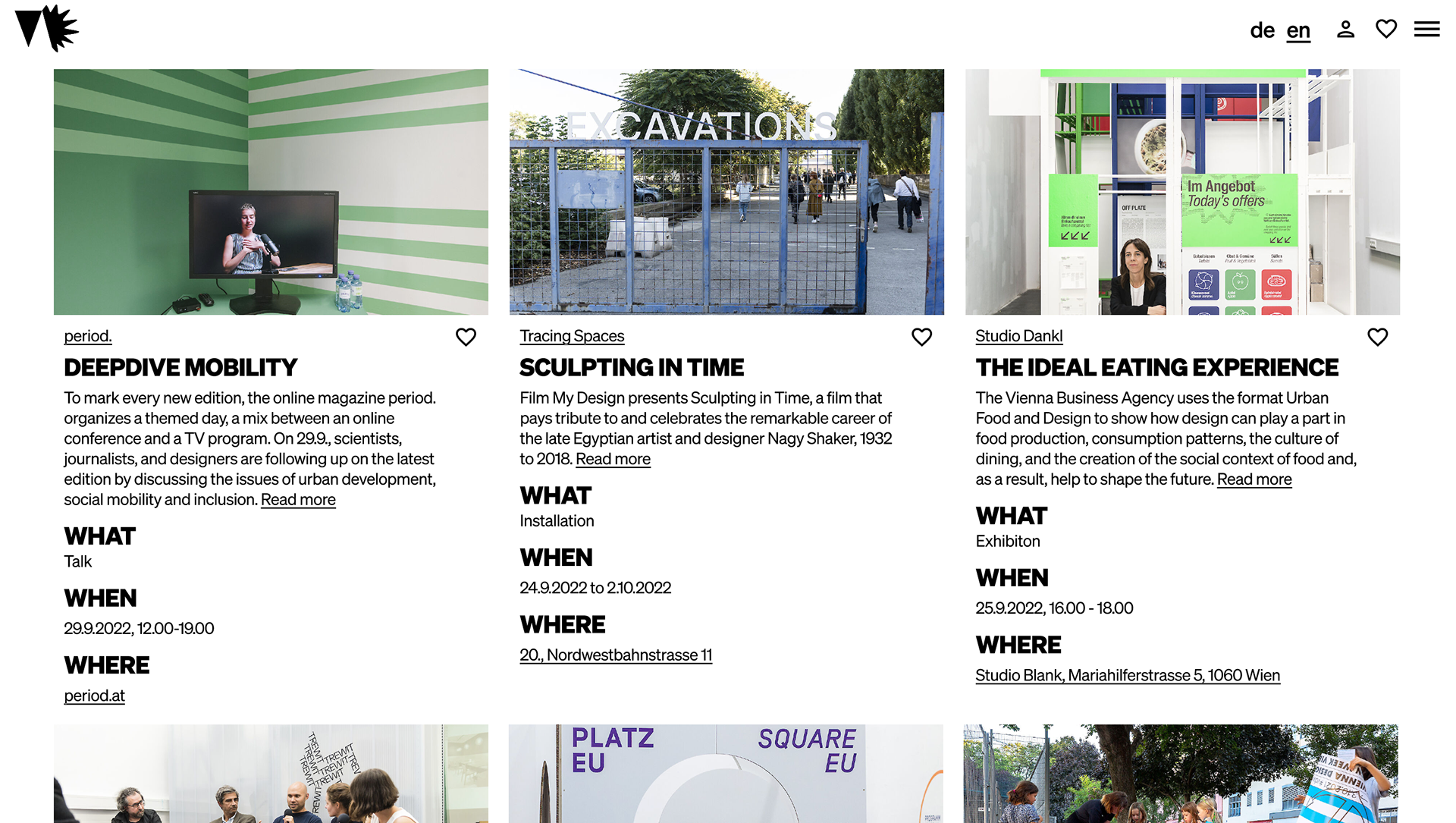
The desktop version of the site.
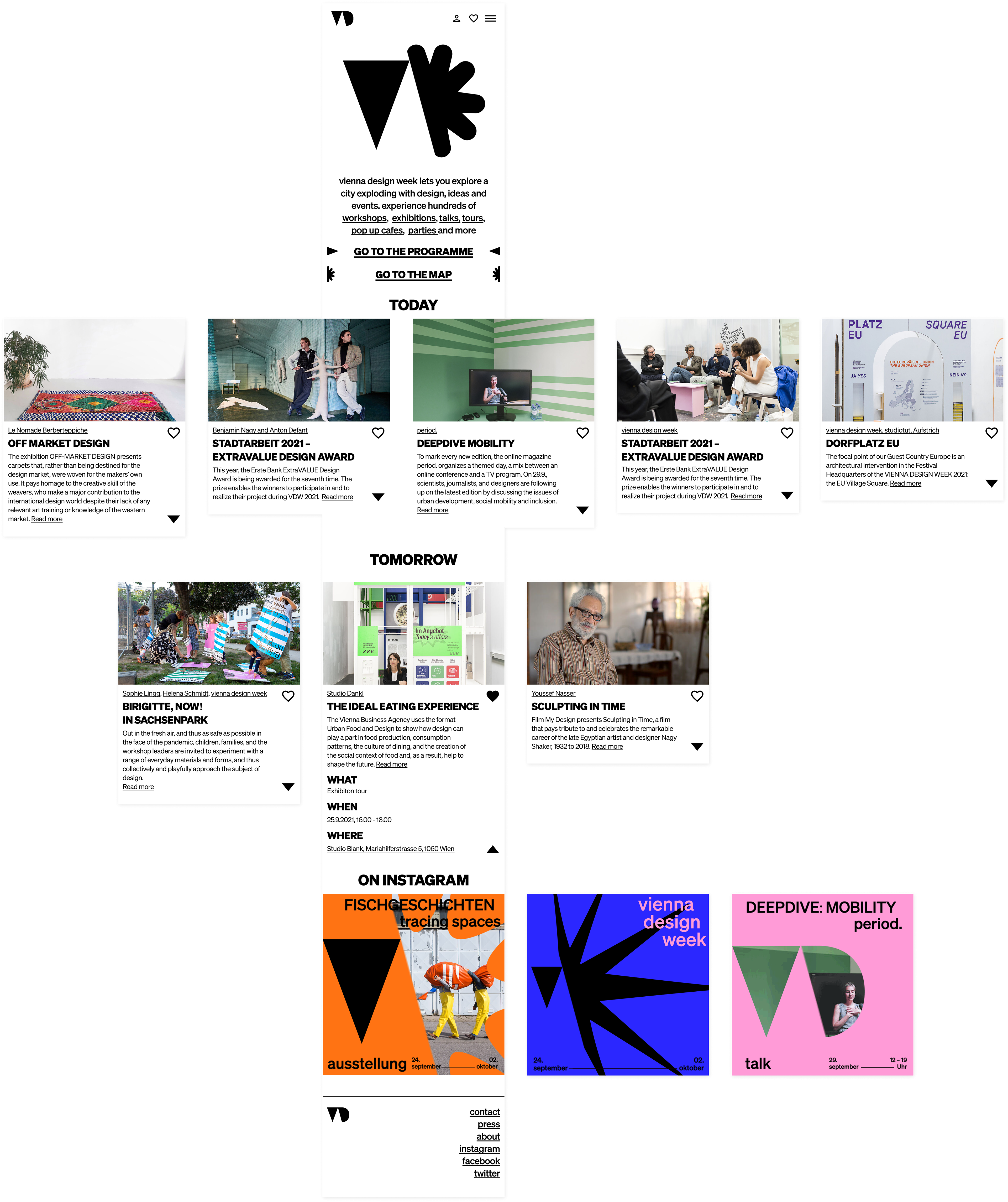
Identity
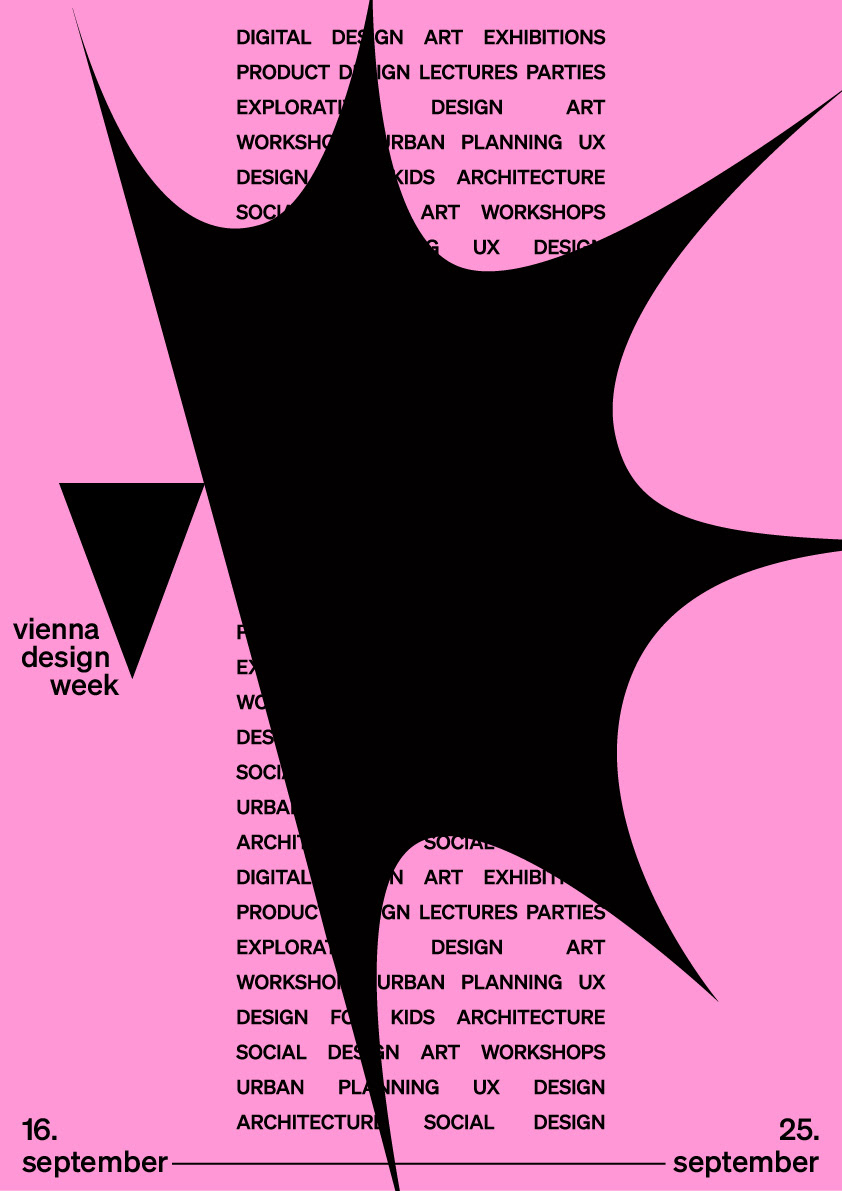
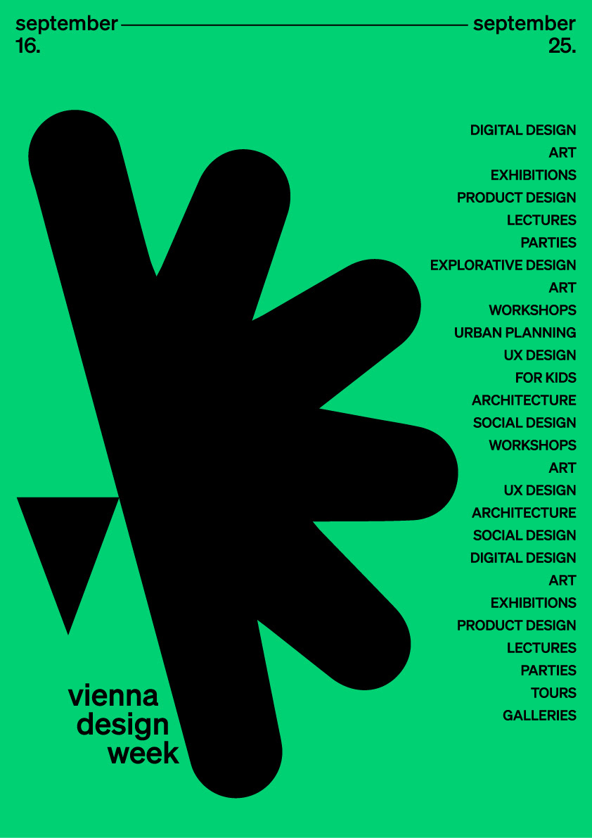
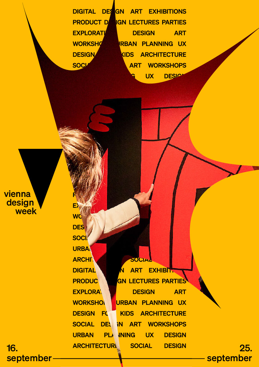
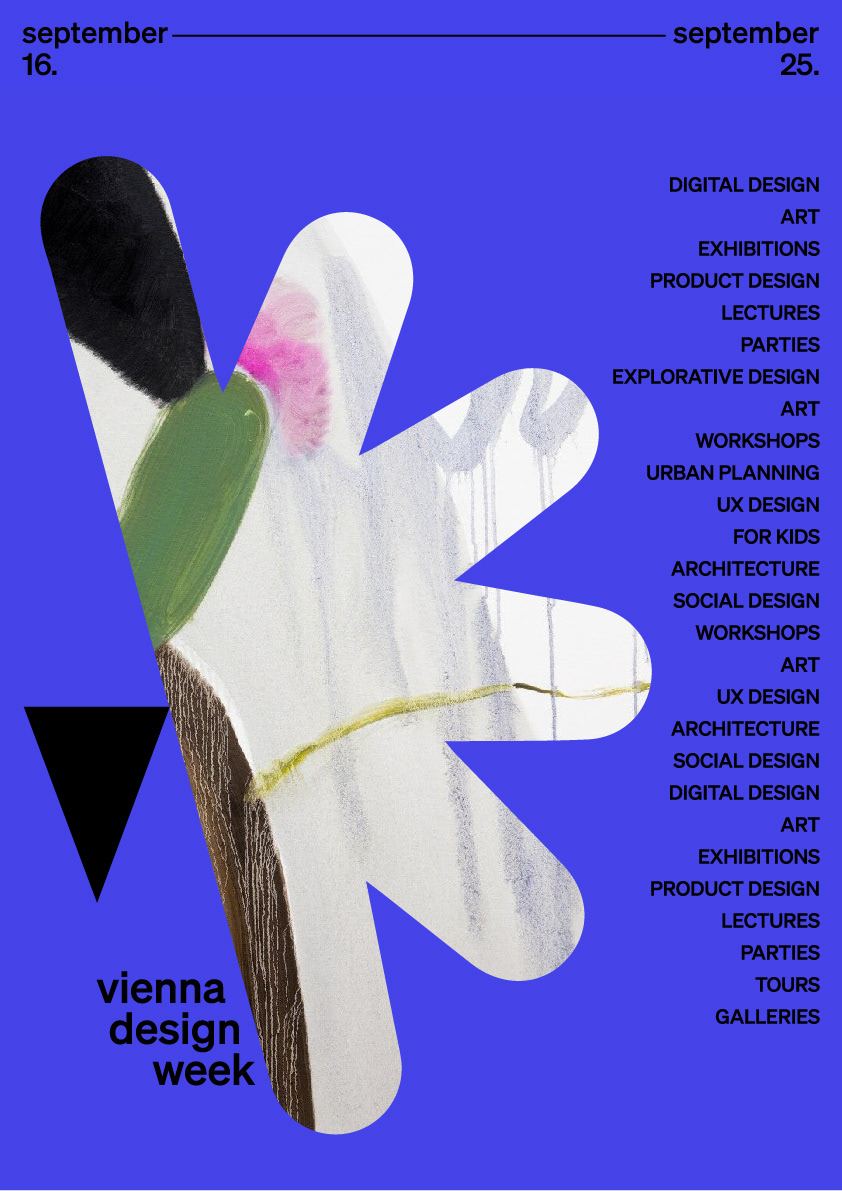
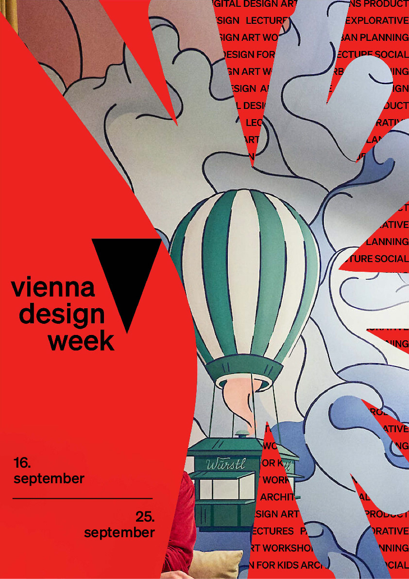
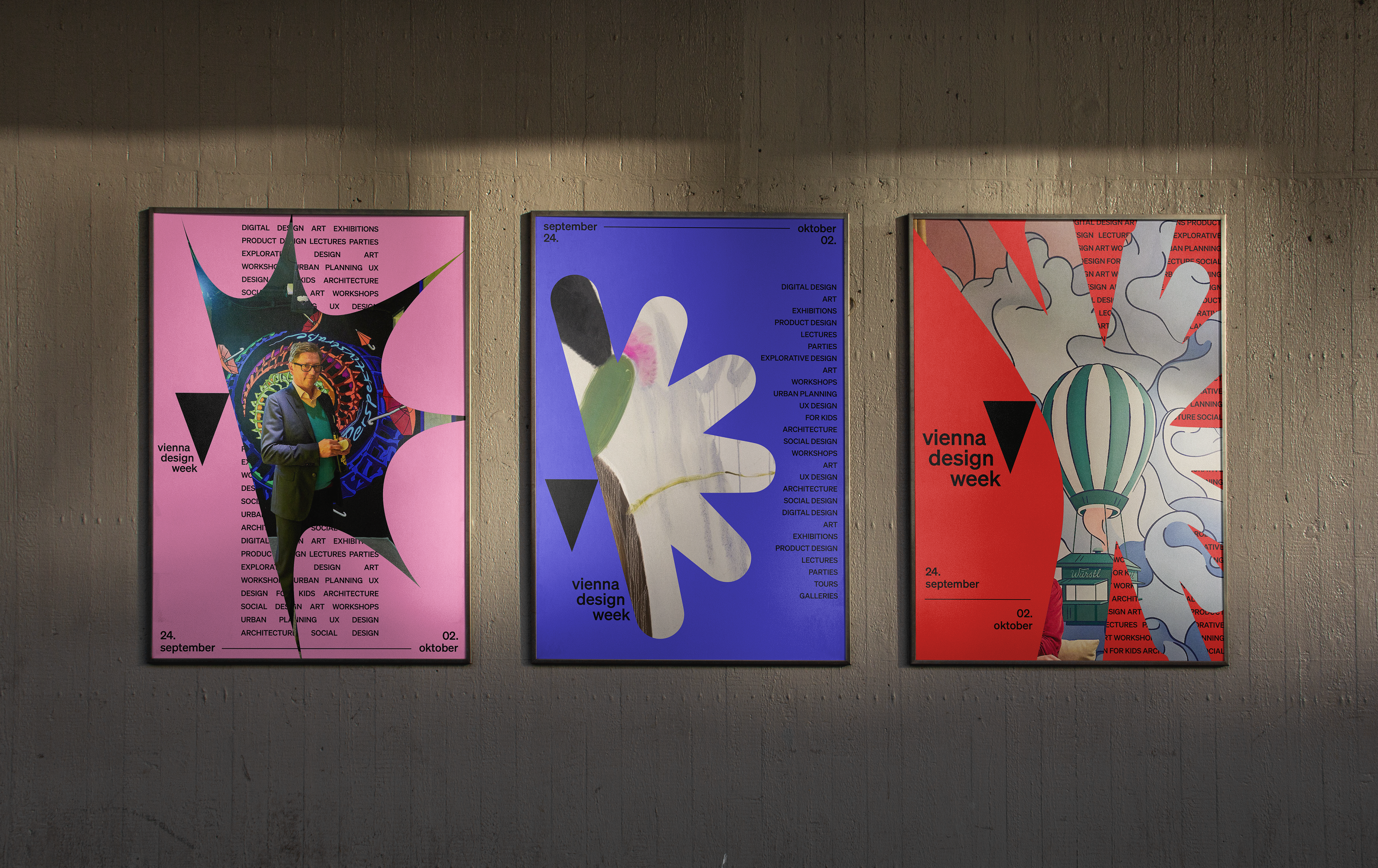
Every design begins as an idea, and ideas generate change. We turned that spark into the heart of the identity: a symbolic explosion that runs through every touchpoint and frames the festival as a city bursting with design, ideas and events.
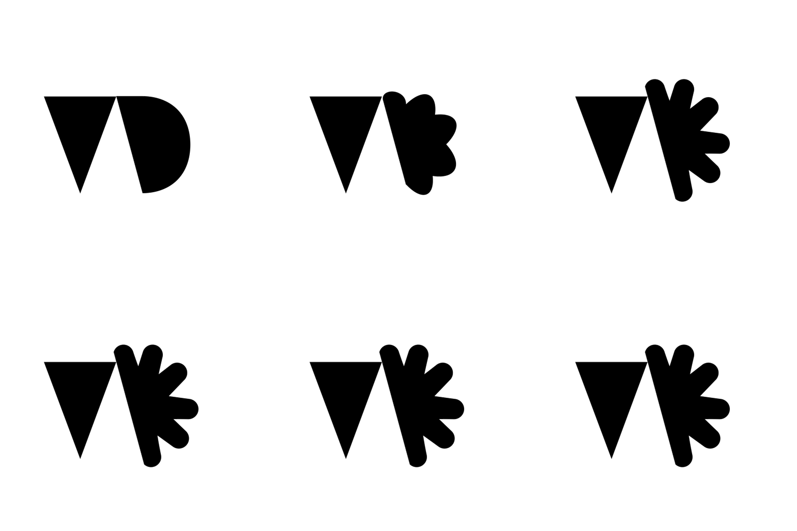
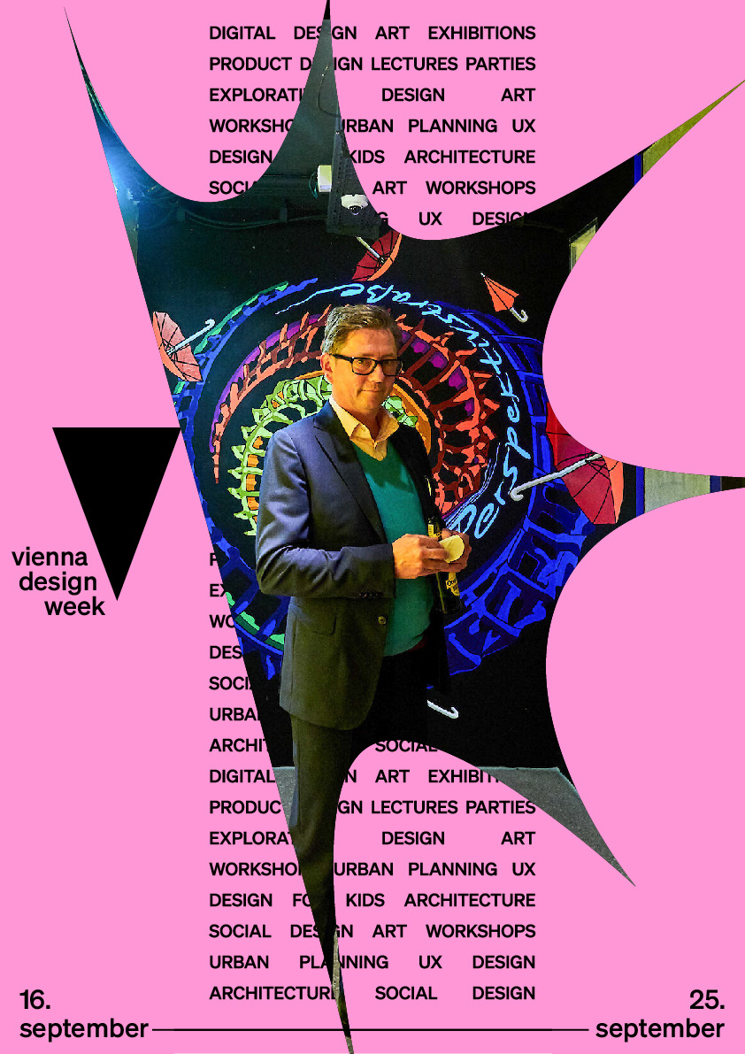
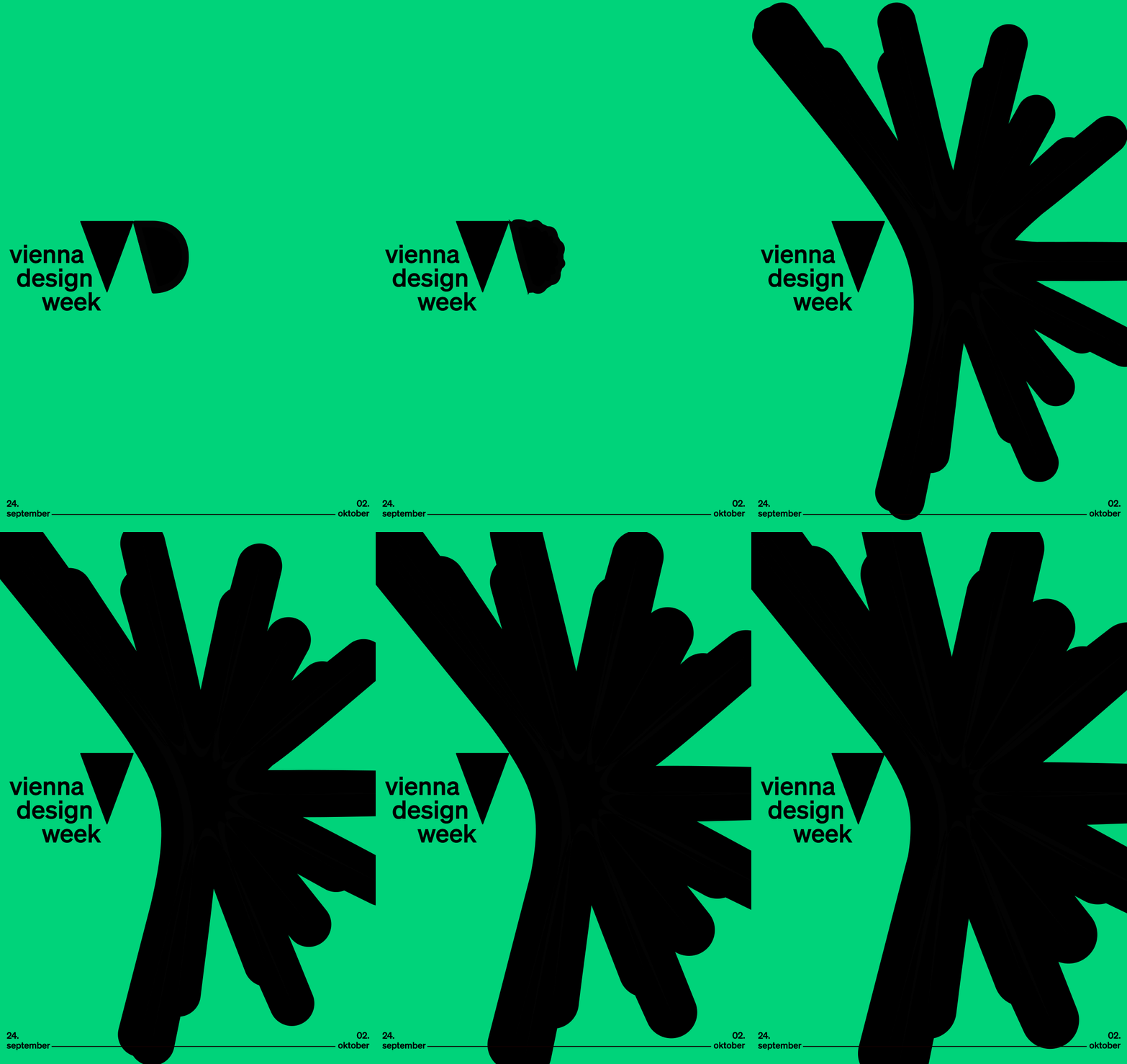
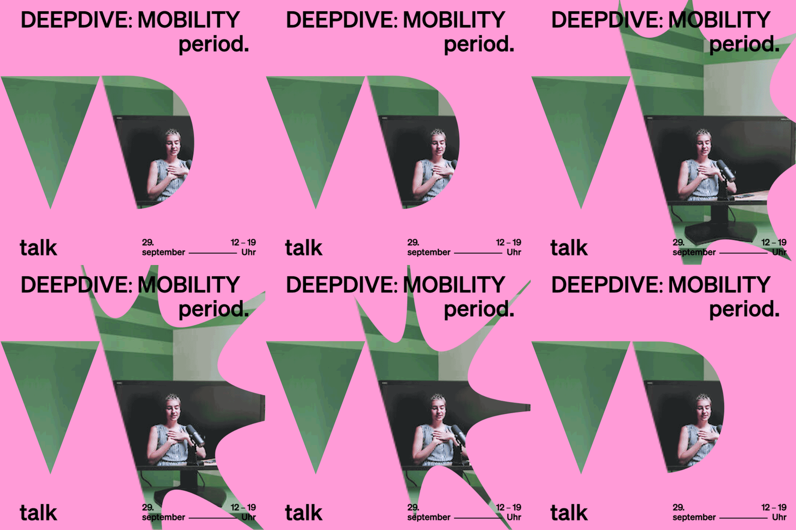
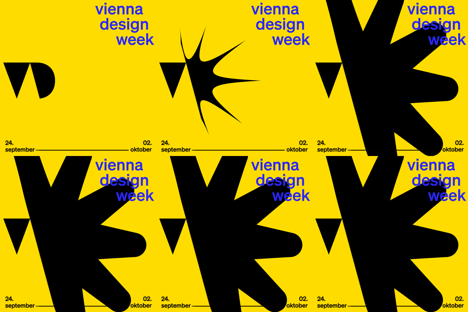
Rather than a fixed logo, we built a living logo ecosystem. A triangle stands in for the V in Vienna and an ever-exploding D for design; together they trace the outline of a W for Week. The D is never static — it moves between exploded states while the V holds as a constant reference point. The two shapes shift in scale, placement and relationship depending on the medium, and work with or without the wordmark, in print and in motion.
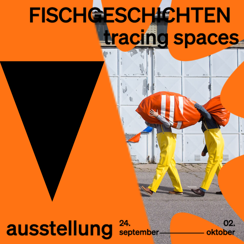
The system extends across posters that use the exploded D as a window into festival events, merchandise, animated social and outdoor content, a modular physical landmark built from the V and D shapes. A six-colour palette and Söhne typography hold it all together.