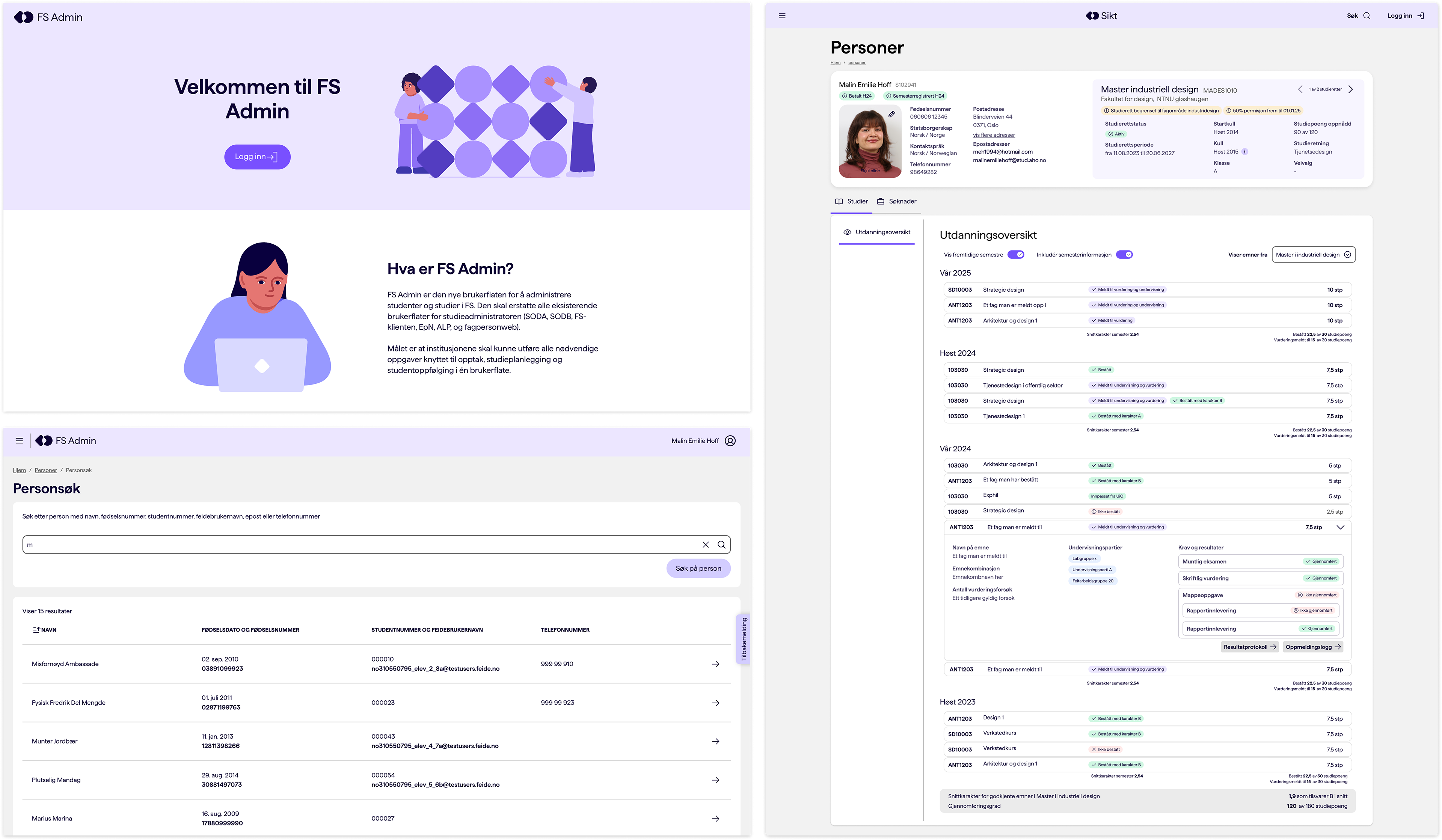
Search and shared patterns in fs admin
Simpler student administration for all of Norway.
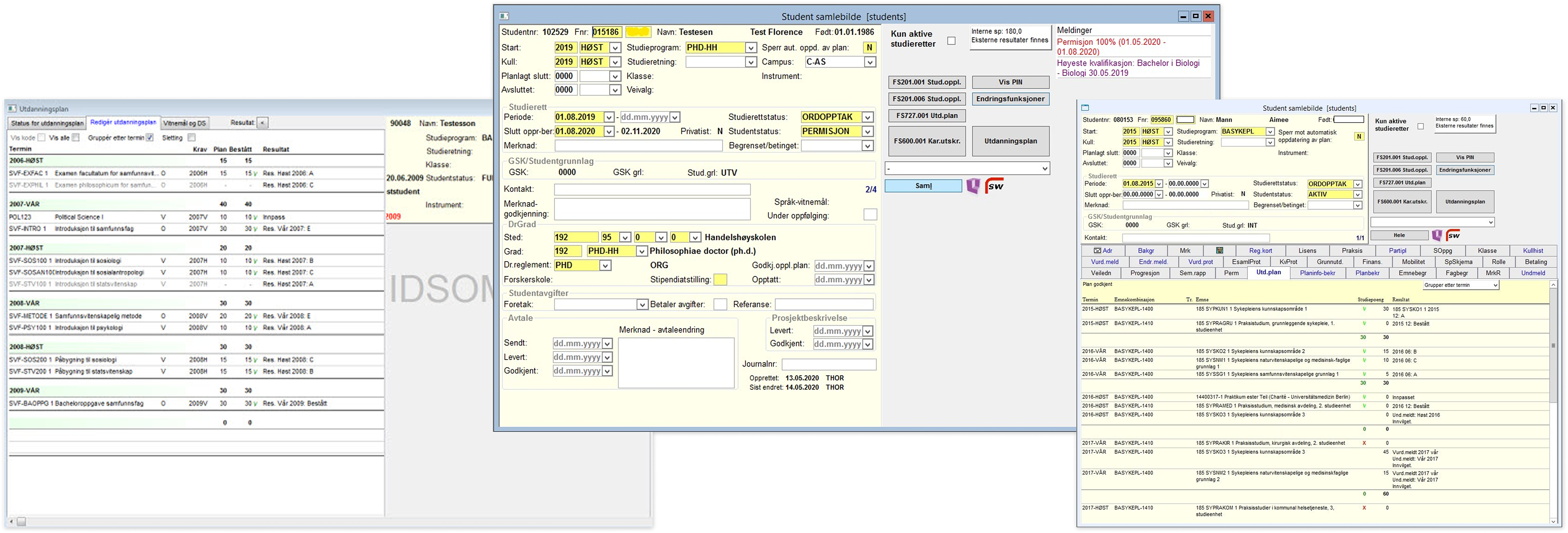
Felles Studentsystem has been the backbone of Norwegian higher education since 1996. Every university and college in the country depends on it, but the interface was built to mirror the database, not the work people actually do in it. I'm modernising how study administrators find, understand and manage the academic building blocks of that system: courses and study programmes.
Where Sikt, Norwegian Agency for Shared Services in Education and Research
When 2026
Team Design, frontend, backend, domain expert
My role Sole designer with full responsibility for product design, user research and facilitation
Result Shared pattern for search solution and detail pages used across FS Admin
The problem: too much and too little at once
Administrators face an interface with hundreds of fields, spread across tabs that follow the shape of the database rather than any real task. Everything is technically there, but finding the right thing means knowing exactly where the system happens to keep it. Experienced users cope by memorising routes and building their own workarounds. New users are simply lost.
That's the paradox I set out to solve: the system is overwhelming and underpowered at the same time. Overwhelming, because every screen is crowded with fields nobody uses. Underpowered, because search still can't reliably surface the one thing you actually need. Fixing it was never about stripping things away it was about restructuring everything around how people really work.
The Assignment: a task-first information architecture
The work began split in two. I led user research on courses (emner) with my own sector group, while the study programme side ran in parallel. Over time the two came together and I carried the same approach across both: rethinking the entire information hierarchy from the ground up, task by task rather than table by table.
That meant four things, closely connected:
Restructuring the information hierarchy recategorising every field and subtab on courses and study programmes around real tasks, instead of database structure.
Language and explanations rewriting labels and guidance so administrators understand what a field is for, and why it matters.
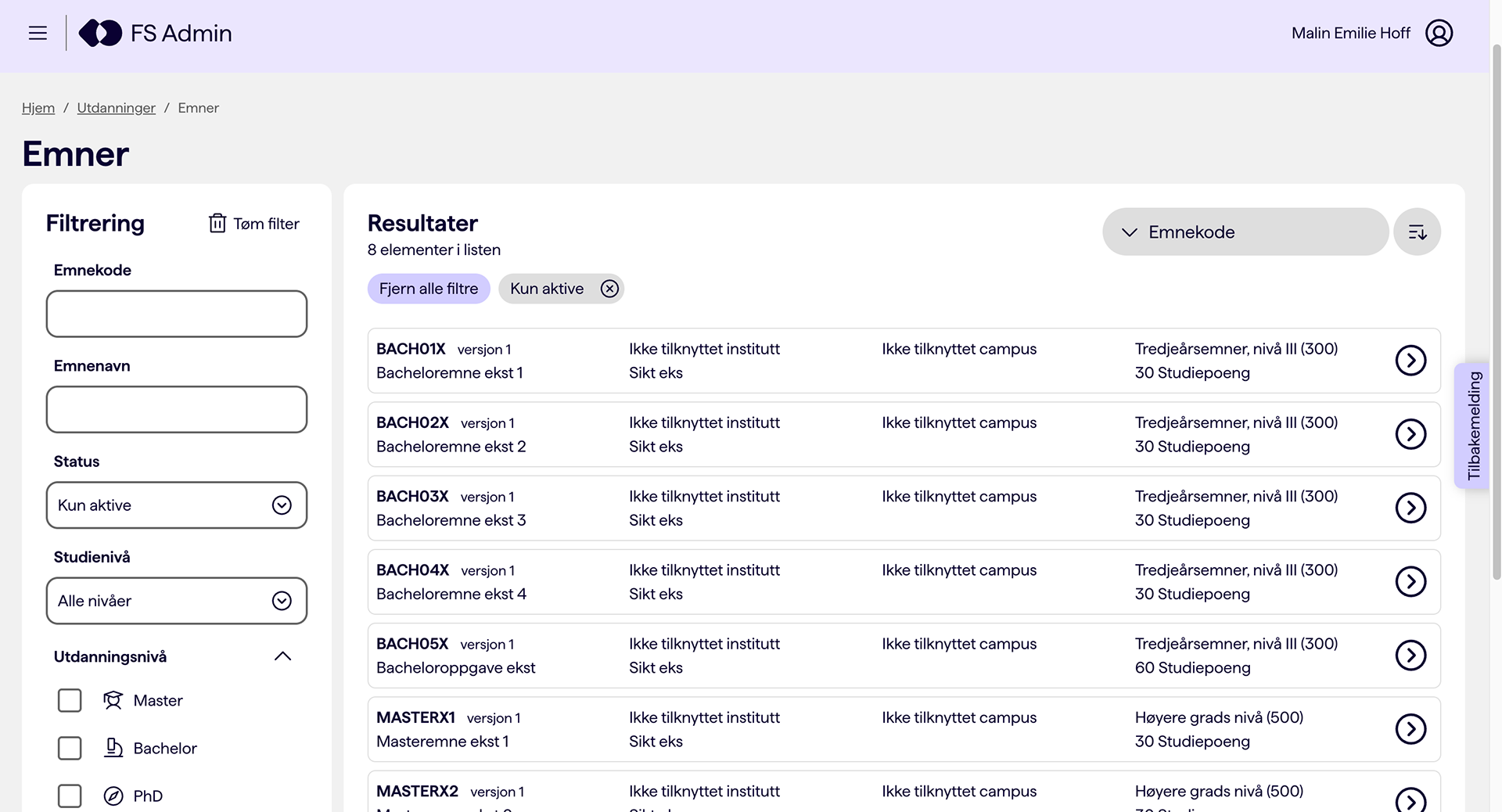
Search that's advanced without being bloated making it possible to find anything you could reasonably need, without drowning the user in filters no one touches.
Bulk actions mapping the real need to act on many items at once, not one at a time.
The process
I started with the work, not the complaints. I recruited representatives from across the sector, deliberately spanning small and large institutions, private and public, and users with very different levels of experience. That range mattered: testing only with experienced users would have hidden the real problems, because they'd already built workarounds for everything. It was the newer and occasional users who revealed where the system actually broke down.
Then I mapped what was actually used. A finding kept repeating: a large share of fields were redundant, filled in because they were mandatory, not because anyone needed the information. Some were mandatory at the database level, which told me real simplification would require changes deeper than the interface alone. That insight reframed the whole project — this wasn't a cosmetic redesign, it was structural.
I facilitated the sector through the hard choices. In workshops I validated findings, pushed the group to prioritise which fields genuinely mattered, and explored how the structure could be simplified without losing what specific institutions depend on, the constraint that makes this system difficult, since 30+ institutions all use it differently.
Then I prototyped and tested the new hierarchy, labels and search in Figma, in close collaboration with developers on what was feasible and how to build it well.
From fragmented screens to a shared pattern
As the product grew, the teams drifted apart. Everyone built their own components where the component library fell short, and everyone insisted their pages had to look the way they did because of unique needs. The result was an interface that pulled in different directions, and a lot of duplicated work.
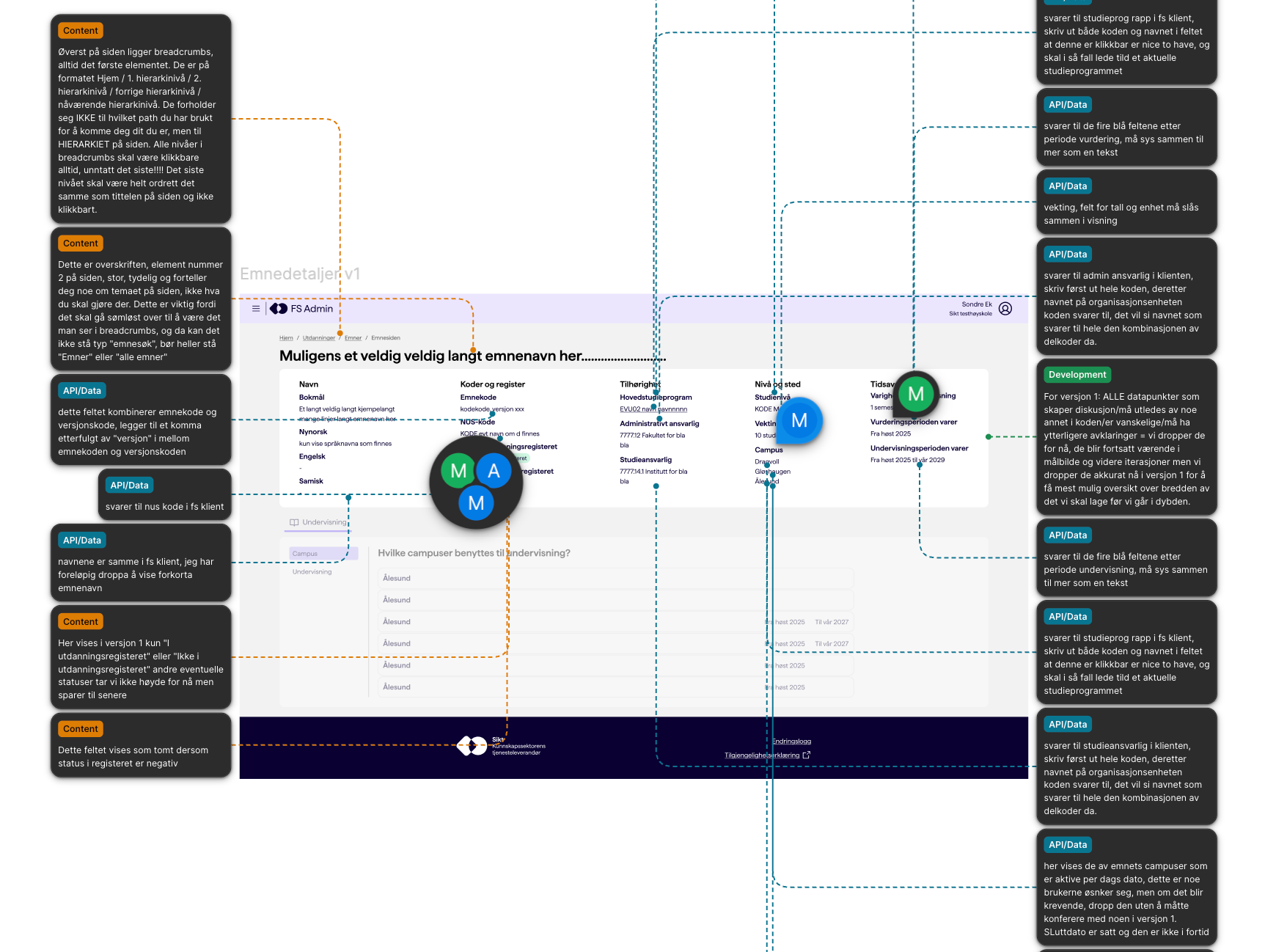
I took the initiative to bring the designers together across the product, and facilitated a series of workshops where we went through the pages feature by feature and clarified what we actually agreed on, and what still needed to be settled. What we landed on, I documented as shared patterns and guidelines, among them when to use a modal and when not to, how search pages should look, and how detail pages are built up.
The effect was concrete: where we previously had five slightly different search pages, we now have one, and the detail pages that used to pull in every direction are replaced by a single flexible pattern that covers all the original needs. The patterns are easy for designers to adopt through slots in Figma, and have a matching layout component for developers — so they give both a more coherent interface and less code to build and maintain. Today the patterns are used across nearly all the main pages in the product.
That's the part I'm proudest of. What started as a fix for a few crowded screens became a way of working that outlived the screens themselves.
What's next
The next phase is the harder half, and it's underway now: cutting the sheer number of fields and simplifying how new courses and study programmes are created — so administrators enter only what's genuinely needed, and the system finally asks for less instead of more.