God natt oslo
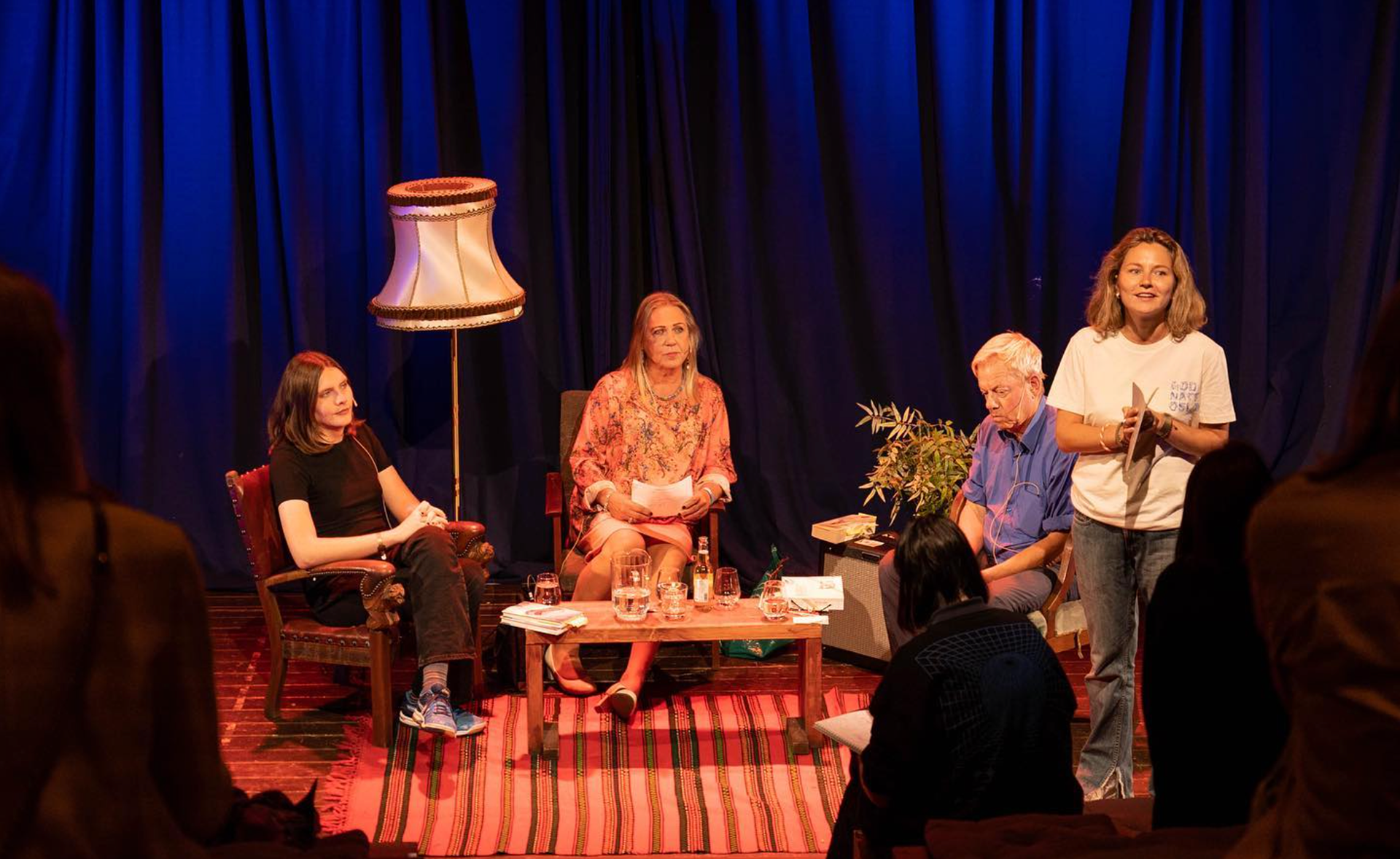
God natt, Oslo is a literature festival at SALT art & music, three evenings of late-night talks, readings, concerts and sauna sessions.
For the 2022 edition I designed the visual identity and the full run of material around it.
Where Freelance for God natt, Oslo (literature festival at SALT)
When 2022
Team Solo
My role Graphic design, illustration and animation
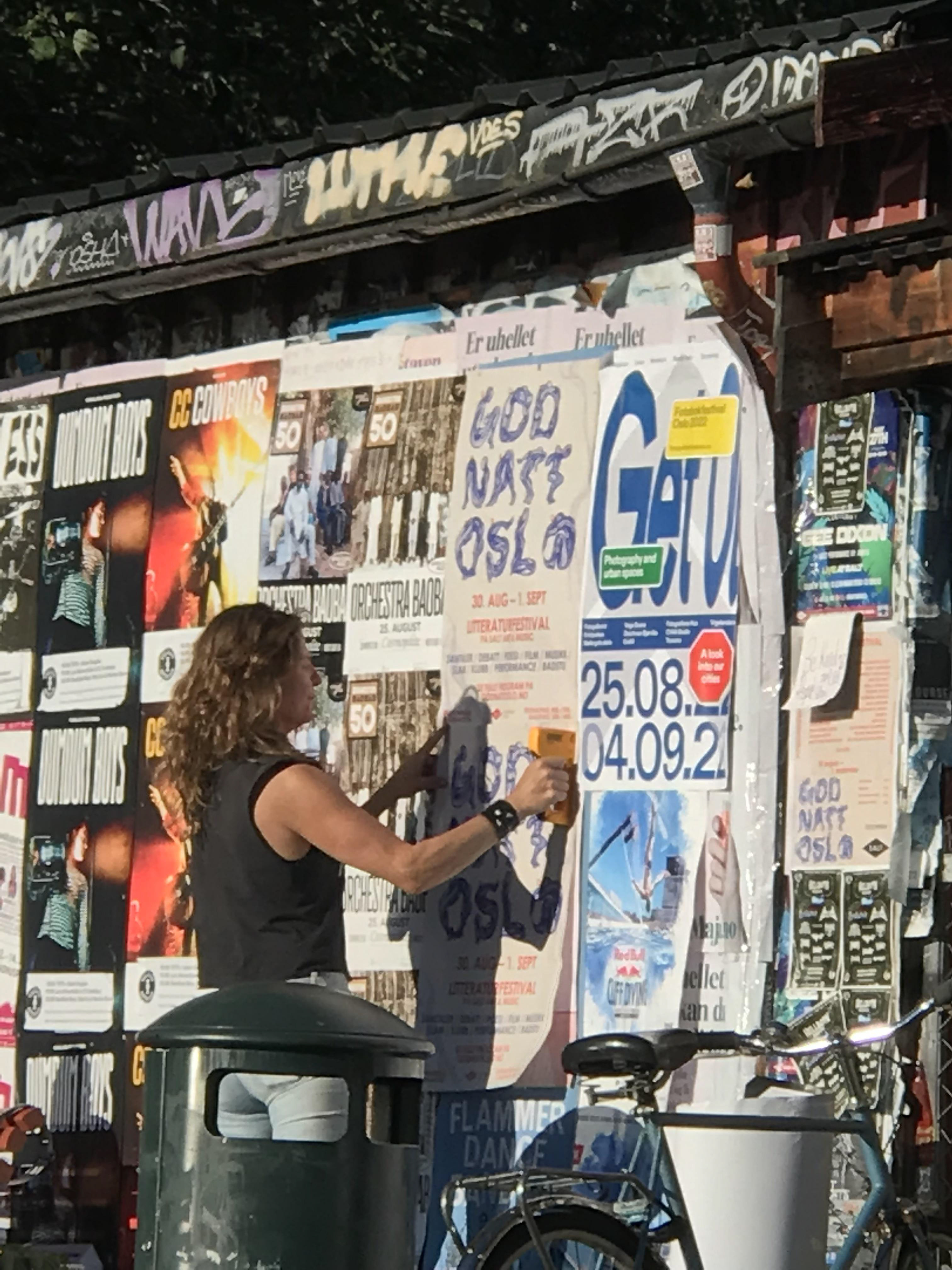
Result Visual identity: animated logo, merch, Instagram and Facebook templates, typography and posting guidelines
2022 was Skeivt kulturår in Norway, and the festival used the year to build its program around body, sexuality, identity and freedom.
From the first client meeting the brief was clear on tone: exciting, thought-provoking, a serious arena for literature, and a way to pull something traditional into a more modern and bodily register.
That gave me something to design toward. I wanted the identity to hold the theme without spelling it out, and to reflect how closely our identity is tied to the words we use to describe ourselves. Words create people as much as the other way around.
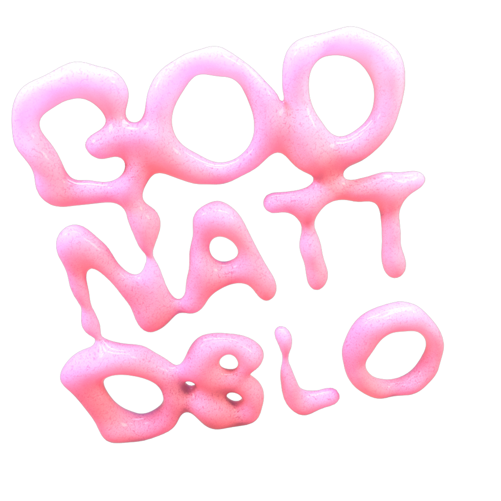
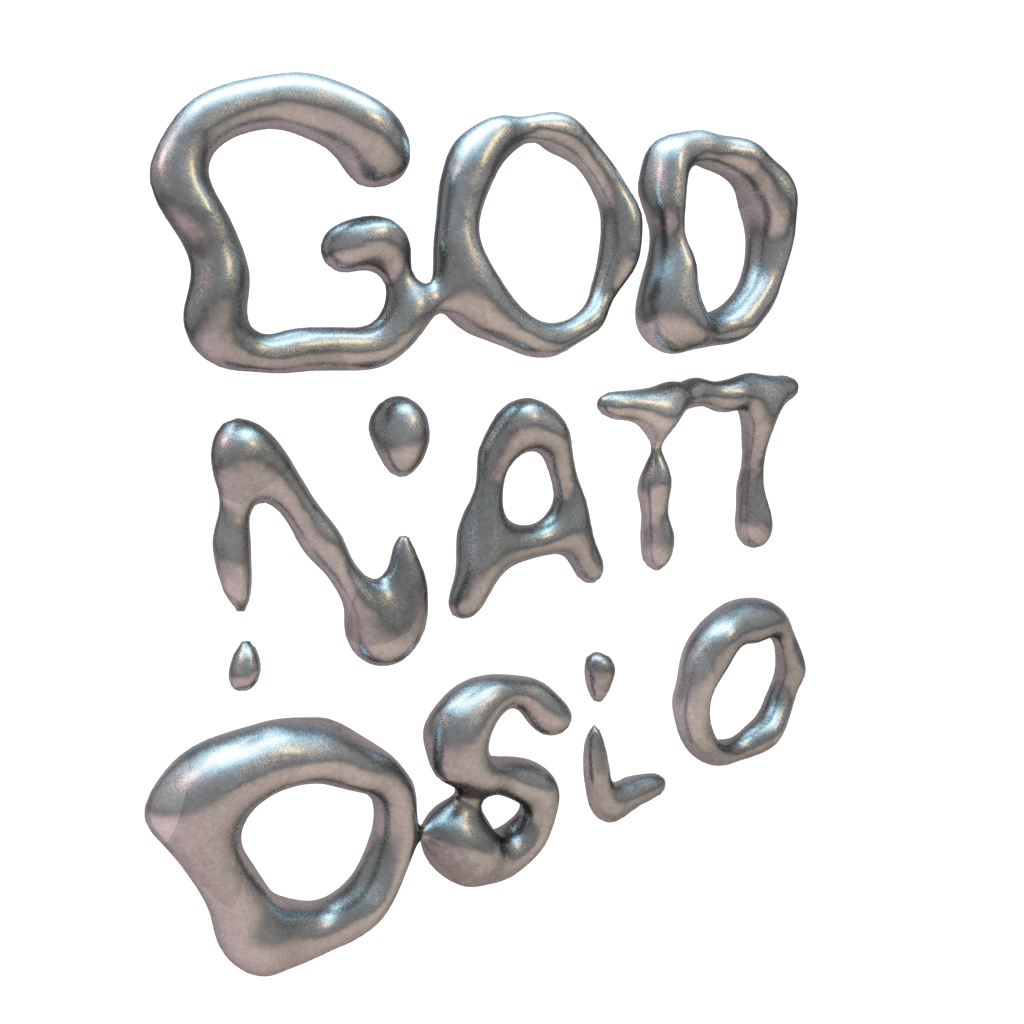
I explored a few directions before landing. One was a 3D texture concept, more on-trend and modern, where textures fill the screen before the letters emerge.
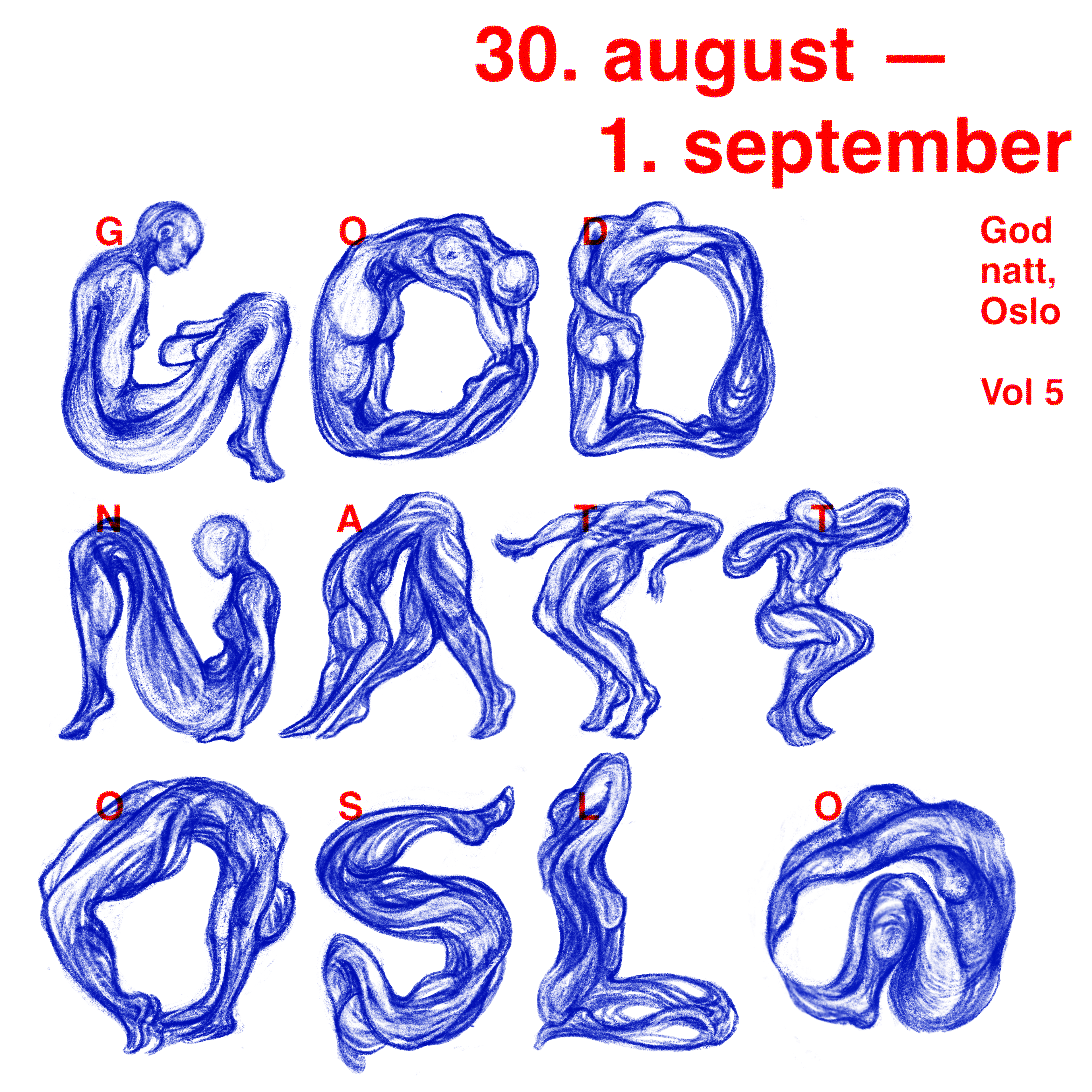
Another was a people concept, where the letters are drawn from human figures. The client responded to the bodies, since they sat so naturally with the Skeivt kulturår theme, so that was the direction I took forward.
My instinct was to pull it somewhere more traditional and less playful, which is where the hand-drawn style came in, tying the figures back to the physical, bodily side of books and to literature itself. Carrying human figures, a variable font and 3D elements all at once felt scattered, so I kept the variable font as a tool for animation rather than a concept in its own right.
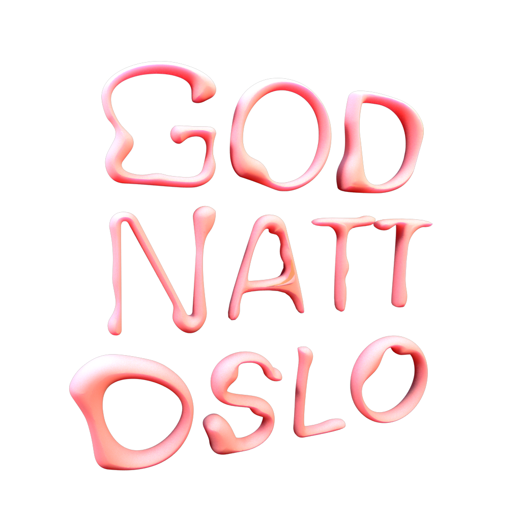
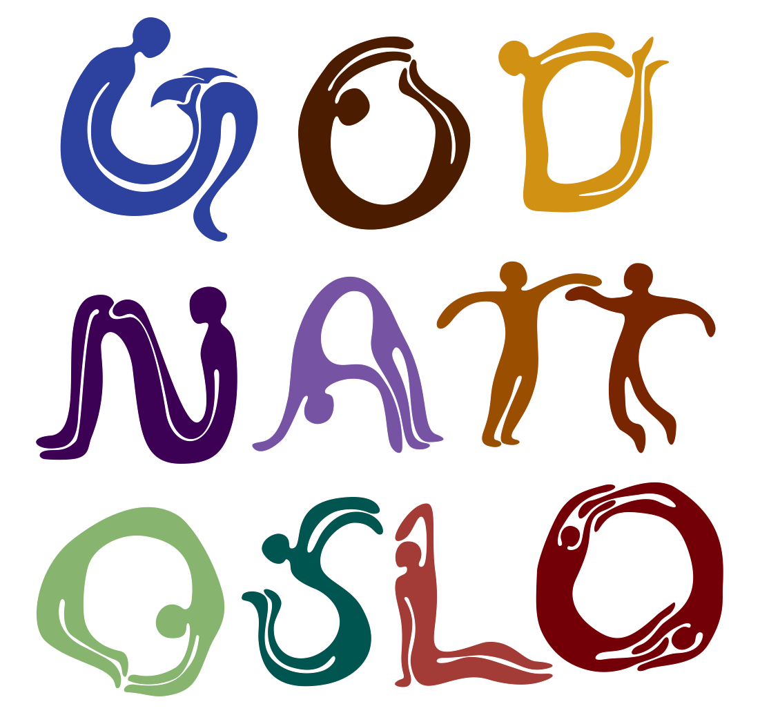
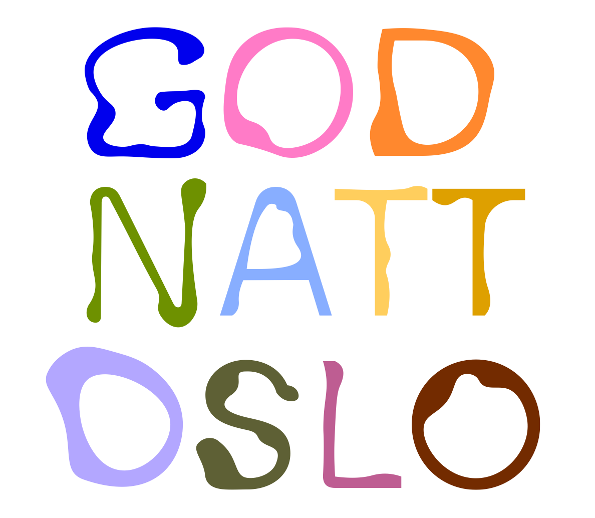
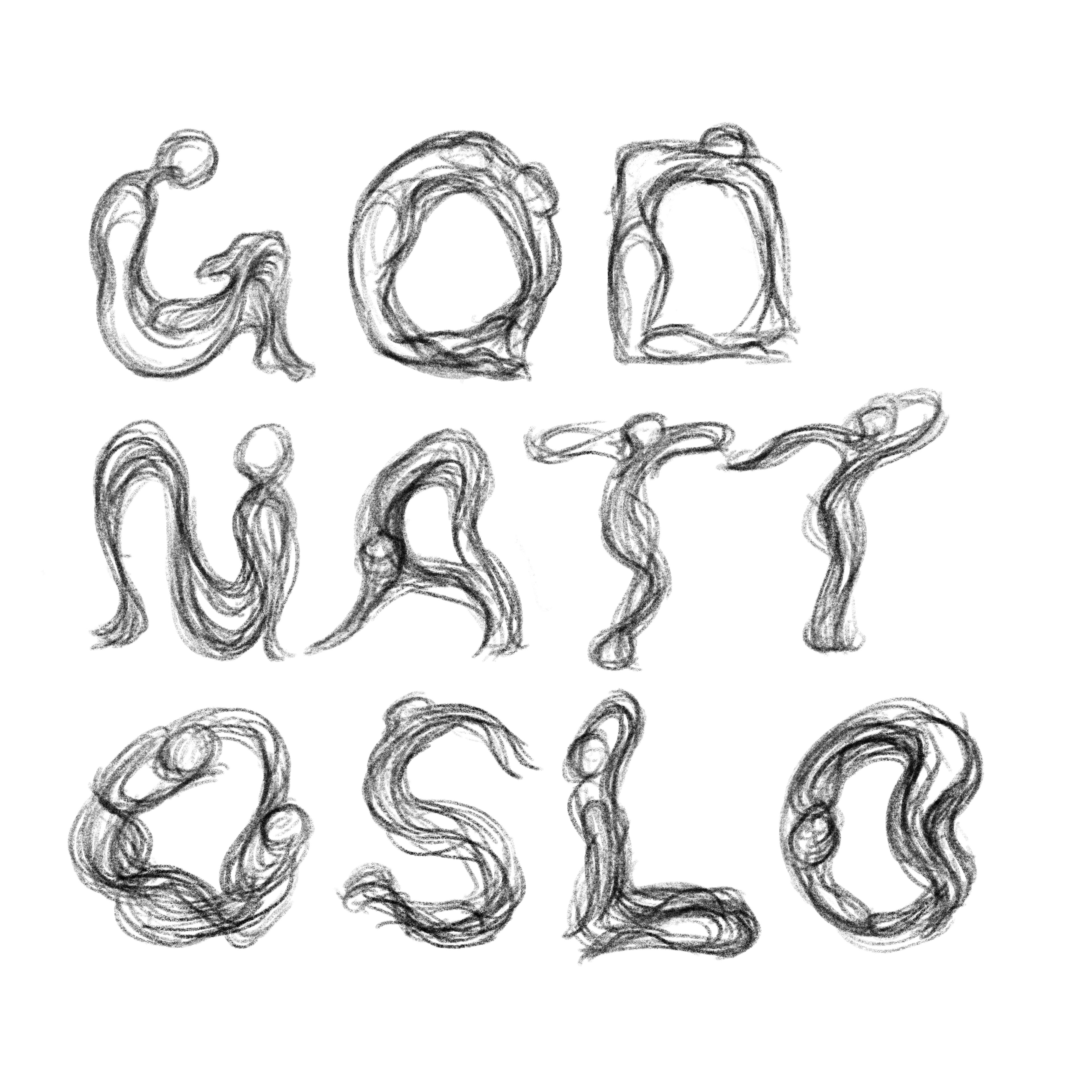
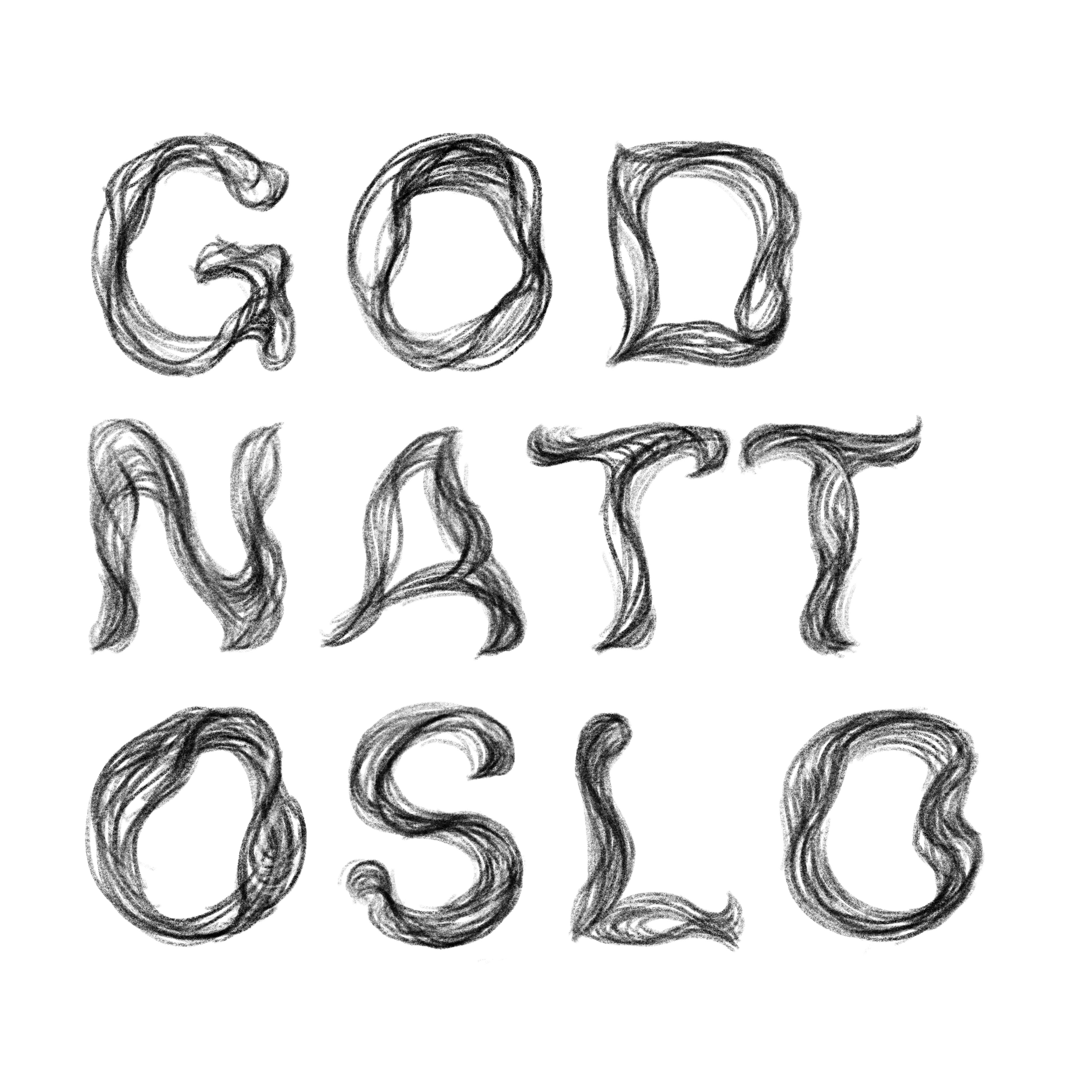
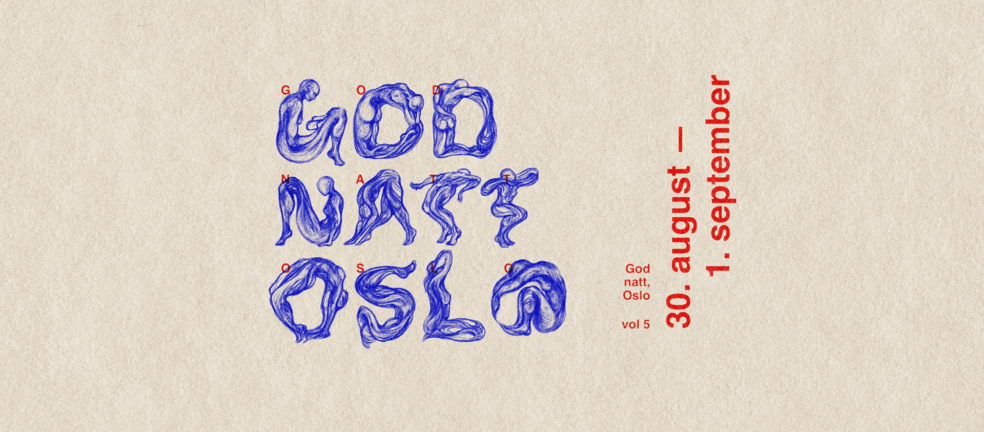
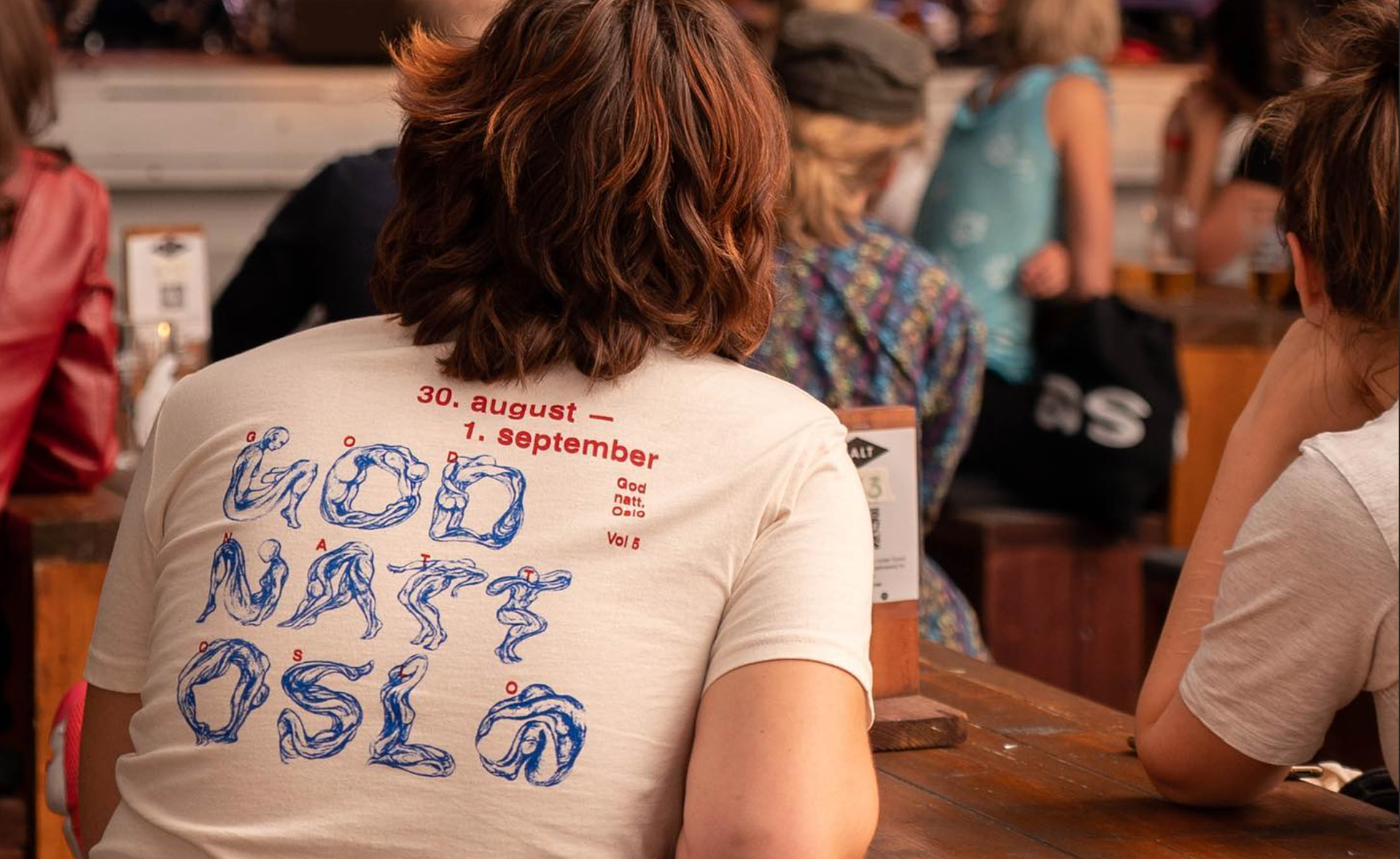
The final identity is built around a hand-drawn "God natt, Oslo" wordmark, with the G working as a standalone mark and the rest kept loose and organic. In the animated logo, the letters unravel and redraw themselves from a hand drawn organic typeface into hand-drawn silhouettes of people, so the name of the festival becomes the bodies and identities the program is about.
In many settings the background is a paper texture that ties the identity back to books and print, though it also works without, on flat colour or black, for a cleaner and more modern register.
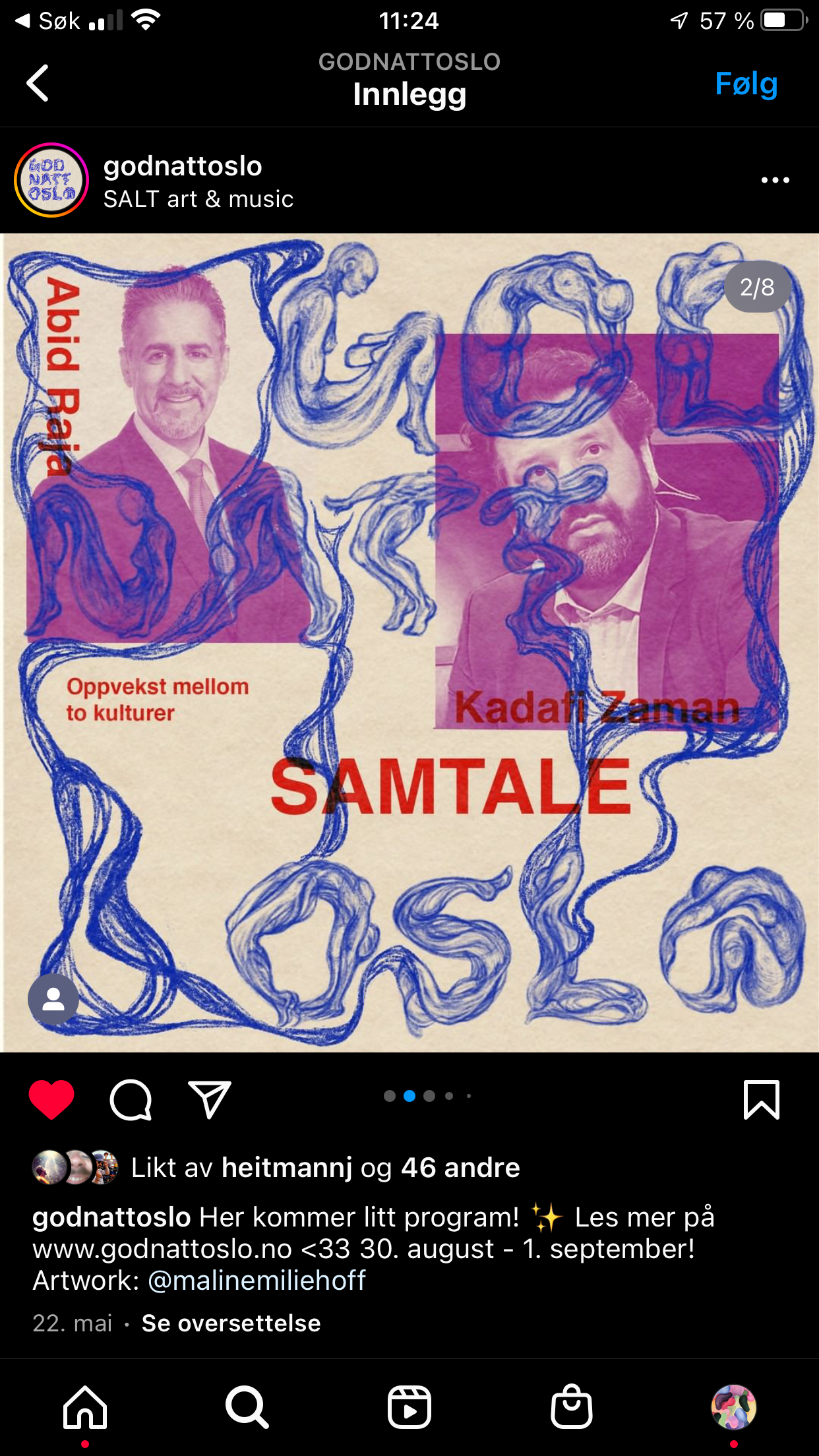
The same organic letterforms carry through the rest of the material, with poster and social templates where organic shapes frame the speakers, and the running typography kept simple and rigid for balance.
I carried it across the cover image, posters, social teasers, story profile picture and merch, keeping everything recognisably one family while letting each piece set its own tone.